The Truth About Your “Mobile Friendly Website" – Is It Really Responsive?
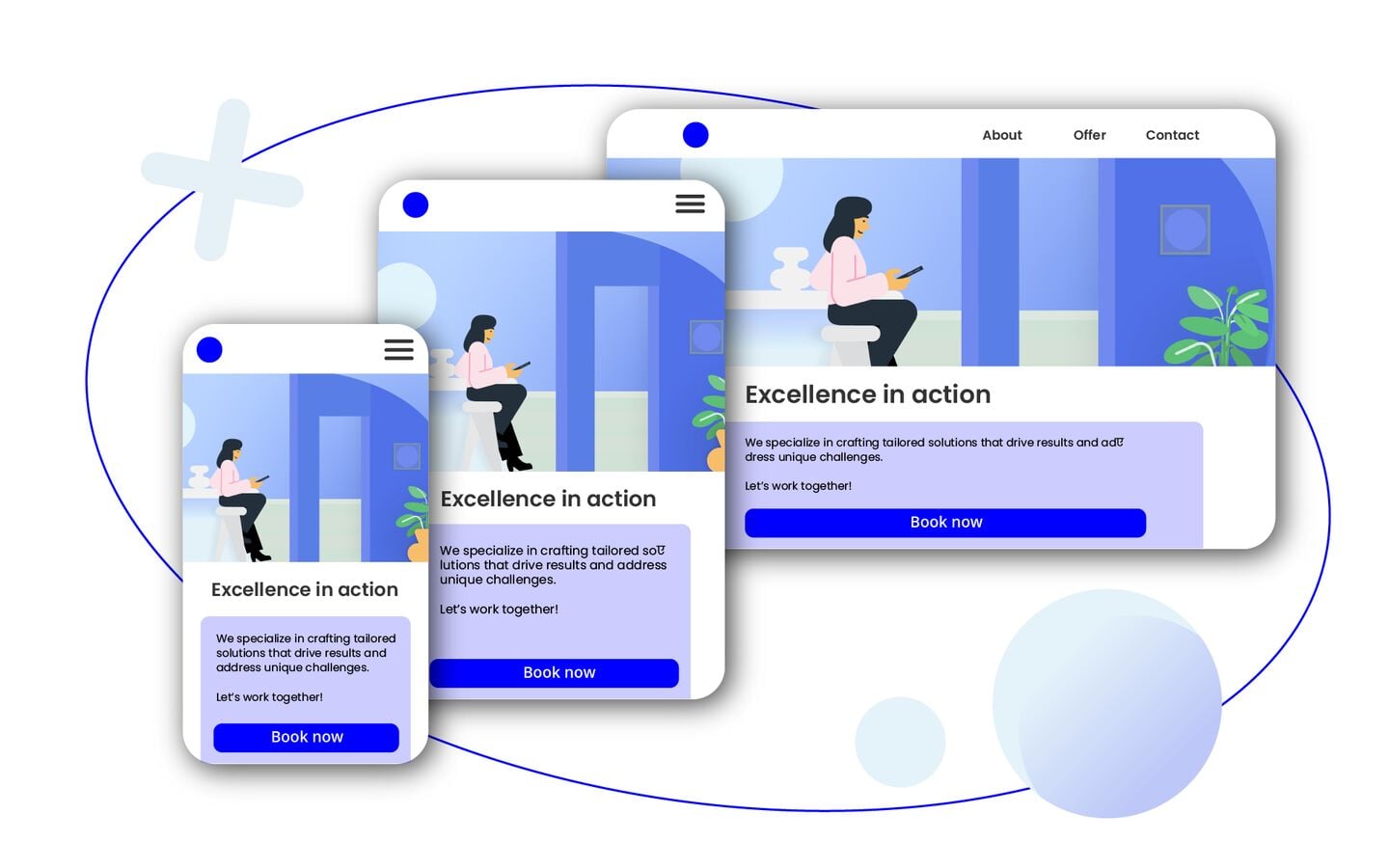
Are you sure your business has a really mobile friendly website? Think what would be your potential customer's impression. Imagine this: A potential customer visits your website on their smartphone, excited to learn about your business. But as the page loads, they’re greeted with oversized images, text too small to read, and buttons so tiny they can’t be clicked without zooming in. Frustrated, they leave. Now multiply this scenario by hundreds, maybe thousands of visitors. The impact? Lost conversions, lost revenue, and a reputation for poor user experience.
Is your website really responsive, or just partially adapted? And how to make a website mobile friendly? Let’s dive into why proper implementation of responsive website design is crucial.
Which devices should your website be responsive for?
The simple answer: all devices. Responsiveness means that your site should seamlessly adjust to different screen sizes, resolutions, and device types, including:
-
PCs
-
Tablets
-
Smartphones
Your visitors might be using the latest flagship smartphone, an older model with a low-resolution screen, or even a decade-old desktop monitor. Your site should look great and function well on all of them.
Internet usage statistics: why a mobile friendly website is essential
The way users use the web has dramatically shifted over the years:
The average adult spends 6 hours and 38 minutes online daily, with:
3 hours and 46 minutes on mobile devices (57%)
2 hours and 52 minutes on desktop (43%)
Mobile has overtaken desktop, but desktop usage is still significant. In fact, 85% of people believe a business’s mobile website should be as good as—or better than—its desktop version. If you do not have a mobile-friendly website, users are five times more likely to abandon it. This is why the modern web design approach follows the principle of “mobile first, but not mobile only."
What web design is a responsive web design?
Web design approaches have evolved alongside technology. Let’s break them down from the oldest—and least effective—to the most advanced and flexible.
Fixed website design - an outdated approach
A fixed layout has a predefined width (e.g., 960px or 1024px) that does not change regardless of screen size. While easy to develop, it is:
-
Too wide for small screens (requires horizontal scrolling) ❌
-
Too narrow on large monitors (wasted space) ❌
-
Cheap and simple—but NOT recommended in today’s world. ❌
Fixed website designs were common in the early days of the Internet when most users accessed the web via desktop computers. However, with the rise of mobile devices and high-resolution displays, they have become obsolete. Businesses that do not have mobile-friendly websites risk alienating a significant portion of their audience.
Fluid (liquid) website design - too unpredictable
A fluid layout uses percentage-based widths instead of fixed pixels. This allows the page to expand and shrink depending on screen size. However, there is no control over how content appears, leading to:
-
Unintended distortions on extremely wide or narrow screens ❌
-
Elements stretching in unpredictable ways ❌
-
Better than fixed design but still problematic ❌
Fluid design was a step in the right direction, as it allowed for some level of flexibility. However, without proper constraints, elements on a webpage could become disproportionate, making the user experience inconsistent across different screen sizes.
Adaptive website design - a transitional approach
Adaptive web design (AWD) detects the user’s device and loads a predesigned layout tailored to its screen size. While this ensures a more controlled presentation, it comes with its own set of challenges.
-
Tailored layouts for different devices. ✅
-
Requires multiple versions of the same website. ❌
-
Significantly more time-consuming and expensive than responsive design. ⚠️
Although AWD offers a structured approach to design, its high resource demands make it a less popular choice today. Most modern businesses prefer responsive web design for its flexibility and efficiency.
Responsive website design – the gold standard
Responsive web design (RWD) is the most effective approach, ensuring that content dynamically adjusts to any screen size using:
-
Flexible grid layouts ✅
-
CSS media queries ✅
-
Responsive images & typography ✅
-
Content that adapts intelligently (e.g., hiding/showing elements as needed) ✅
If a business hasn’t adopted a responsive layout yet, it should or is already considering the transition.
How many business websites use responsive web design?
It is estimated that 90% of websites worldwide use responsive website design. To examine how this figure applies to business usecases, we analyzed nearly 3,000 websites (including service providers, e-commerce stores, restaurants, and personal portfolios). The results:
-
94.39%use responsive design ✅ -
5.2%use adaptive design ⚠️ -
0.17%use fluid design ❌ -
0.24%use fixed design ❌
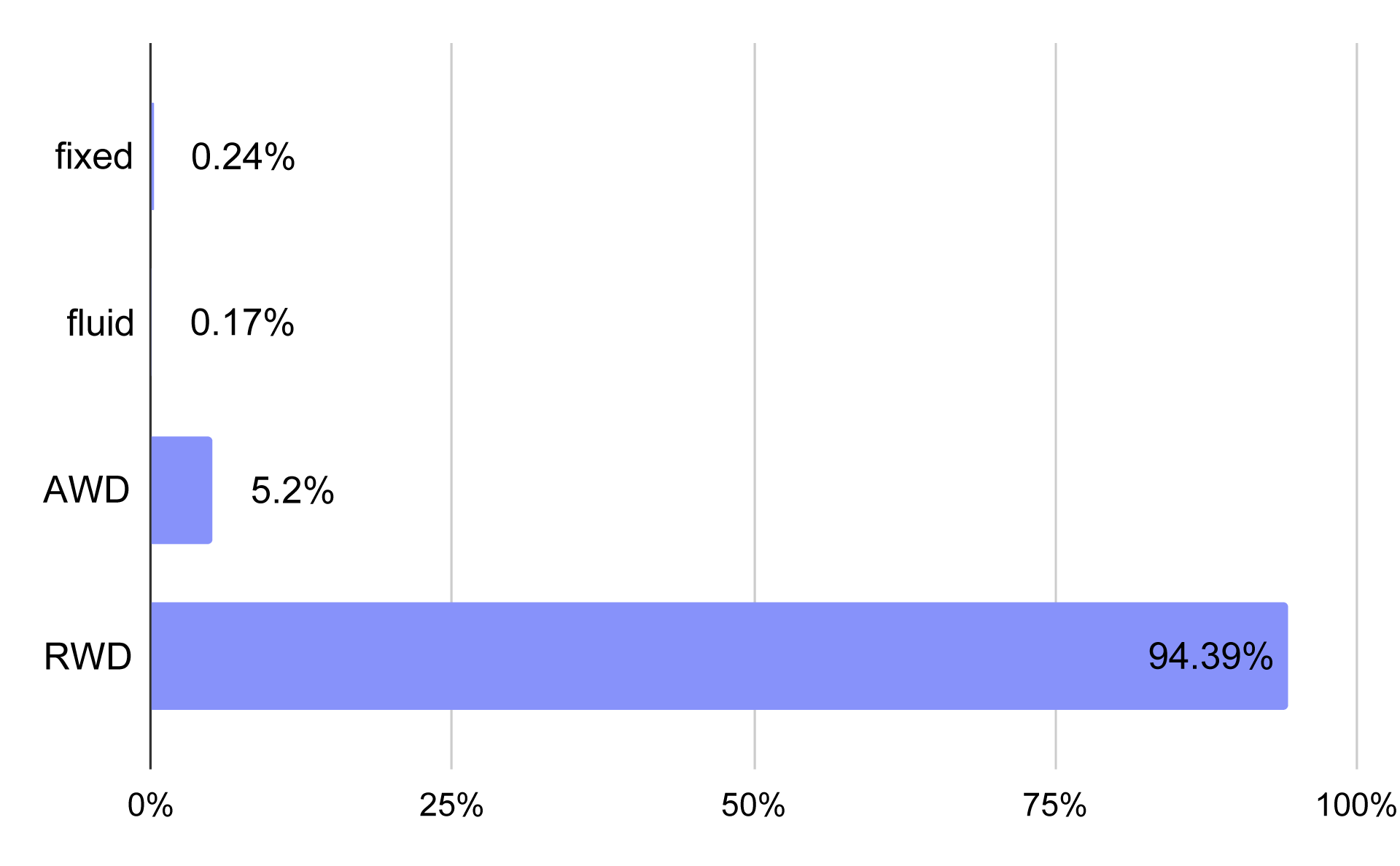
The prevalence of different types of web design on business websites
At first glance, this suggests that businesses are doing well— the number of responsive design websites is even higher than the overall average. But is responsive design implemented correctly?
How responsive are "responsive" websites?
To estimate the true effectiveness of responsive web design implementation, we analyzed the percentage of responsive images on each site:
-
0-50% responsive images → Poorly optimized ❌
-
50-80% responsive images → Partially optimized ⚠️
-
80-100% responsive images → Well-optimized ✅
What happens when images don’t have a responsive size? Well, the website doesn’t look its best—images may be too large, requiring horizontal scrolling, and some elements may overlap with the images.
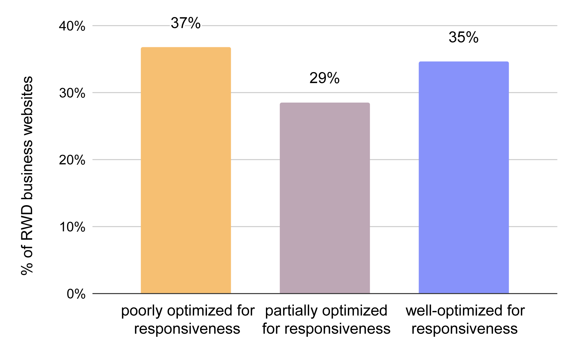
Distribution of websites by optimization for responsive design
We see that among AWD websites, only 35% are properly optimized. Following 29% of business websites are partially optimized, while 37% have few responsive images or are not optimized at all.
How does responsive design accuracy vary by business website type?
Which businesses know best how to make a website mobile friendly? Looking at specific business website categories, we found some notable trends:
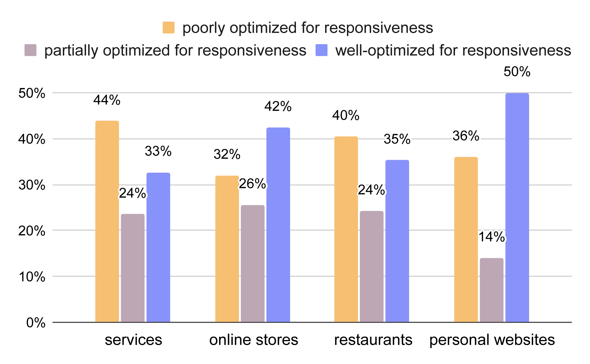
Distribution of business websites by optimization for responsive design - website categories
Service-based businesses struggled the most, with only 33% implementing RWD well. This could be due to the fact that service-based websites often contain fewer images, making optimization a lower priority.
Restaurants performed slightly better (35%), though issues with non-responsive menu images were common.
E-commerce websites had a 42% success rate, as online stores rely heavily on high-quality product images that need to be optimized for different devices.
Personal websites had the highest optimization (50%), likely because freelancers and portfolio sites prioritize strong visual presentation.
These variations can be influenced by:
-
Website size – Fewer images mean fewer optimization issues.
-
Website age – Older sites tend to have outdated implementations of RWD.
-
Business priorities – E-commerce and personal sites place greater emphasis on user experience, while service-based sites may overlook image optimization.
Why is responsive web design important for business?
We know that responsiveness is essential due to the vast diversity of devices, and while the percentage of responsive websites may seem high, it is often misleading. But why are these factors crucial from a practical business perspective?
A frustrating website = a lost customer
The first and most obvious reason is user experience. Nobody enjoys a website that doesn’t function properly or is difficult to navigate. In fact, 73.1% of users cite non-responsive design as a reason for leaving a website.
Lack of device adaptation, along with poor readability (such as contrast issues or cluttered layouts), is one of the leading causes of frustration and high bounce rates.
Desktop & mobile friendly website = higher revenue
For businesses, losing customers due to poor website usability means lower potential profits, frustrated users, and a damaged reputation caused by a low-quality site.
And it’s not just customers who dislike non-responsive websites—search engines penalize them, leading to lower rankings, reduced visibility, and fewer potential visitors.
Responsive website design = less work, more convenience
Responsive or fluid design has become the industry standard, ensuring that websites remain functional and visually appealing across all new screen resolutions and devices—from foldable phones to 4K displays. Moreover, investing in a responsive design reduces long-term maintenance costs and effort, making future updates and optimizations much easier—more on this in the section on website design approaches.
Summary
Today’s digital landscape demands responsive websites to stay competitive. Key takeaways:
-
Responsive website designis the best option for modern businesses. -
94%of business websites claim to be responsive, but only 35% implement it correctly. -
Implementing RWD is essential to prevent revenue loss.
A properly implemented responsive design heavily depends on the chosen CMS—with the right one, you won’t have to worry how to make a website mobile friendly. We encourage you to try our generator and see how you can create a responsive website not just effectively, but also quickly.
Sources:
IKOL Research
Datareportal
Goodfirms