Why is a Low-Contrast Website a Big Business Problem?
Have you ever browsed websites searching for a product or service, only to give up because the text was too hard to read? Maybe the background was too bright, the letters too faint, and critical details practically invisible. Annoying and unprofessional, right?
Contrast errors are the culprits. While they may seem like minor design flaws, they can significantly influence user decisions – from choosing a product to contacting a service provider. In this article, we’ll delve into the issue and explore how low contrast affects not only users but also businesses.
Why is contrast important on websites?
The example from the introduction highlights a glaring (pun intended) example of poor design. Proper contrast ensures that website elements are readable and accessible. Good contrast is the foundation of good design, which, in turn, prioritizes user needs. This becomes crucial when addressing the needs of individuals with disabilities.
Let’s examine which users are particularly affected by contrast issues:
- People with vision problems: around
5.5%of American adults have a vision disability, and many more experience mild vision issues. Additionally,3.7%have some form of color blindness, which makes distinguishing certain colors difficult. That’s why contrast matters so much. - People with cognitive disabilities: those with attention deficits or memory issues rely on clear, easy-to-interpret elements. As much as
13.9%of adult Americans have cognition disabilities. - Older adults: vision and cognitive function often decline with age. As the number of elderly internet users grows, it’s crucial to address their needs.
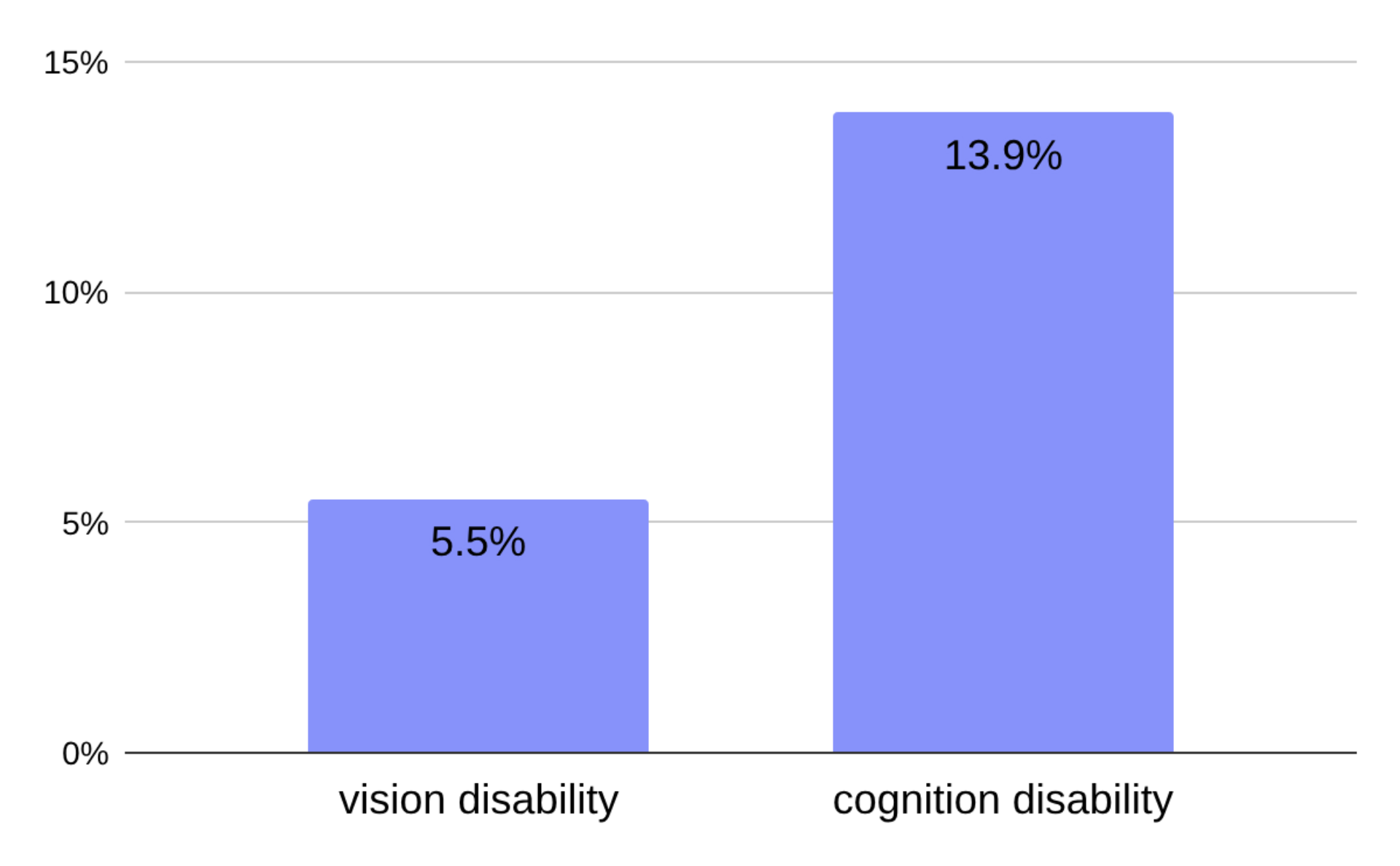
Percentage of vision and cognitive disabilities among adult Americans, U.S. Centers for Disease Control and Prevention
But choosing the right colors is easy, right? Not quite – intuition alone isn’t enough. Readability depends on several factors, such as:
-
differences in luminance.
-
color hues and saturation.
-
font size and style.
-
background textures.
-
and more.
To simplify life for users with disabilities and web designers alike (and as we’ve learned, for everyone), accessibility guidelines were established to ensure effective design.
Accessibility Guidelines for contrast
The most important guideline is the Web Content Accessibility Guidelines (WCAG) developed by the World Wide Web Consortium (W3C). As of October 5, 2023, WCAG 2.2 is the current version. The definition of minimum contrast at Level AA is outlined in Success Criterion 1.4.3:
The visual presentation of text and images of text has a contrast ratio of at least 4.5:1
Large-scale text and images of large-scale text have a contrast ratio of at least 3:1
What is a contrast error?
A contrast issue occurs when an element on a webpage fails to meet the above WCAG criteria. Such elements may be unreadable for users with vision problems and uncomfortable for average users. To avoid these issues, designers should adhere to the guidelines or use CMS solutions optimized for proper contrast implementation.
How common are website contrast errors?
To better understand the prevalence of contrast issues, we conducted our own research focusing on independently managed websites in the U.S. that aim to sell products, services, or promote personal branding. Specifically, we analyzed:
-
service business websites,
-
store websites,
-
restaurant websites,
-
personal websites and portfolios.
We then compared our findings with WebAIM’s annual study, which analyzes the accessibility of one million homepages of the most popular websites worldwide. Their research consistently identifies low contrast as the most common accessibility issue. By contrasting the results, we gained insights into how sales and branding websites differ from the broader sample of high-traffic websites.
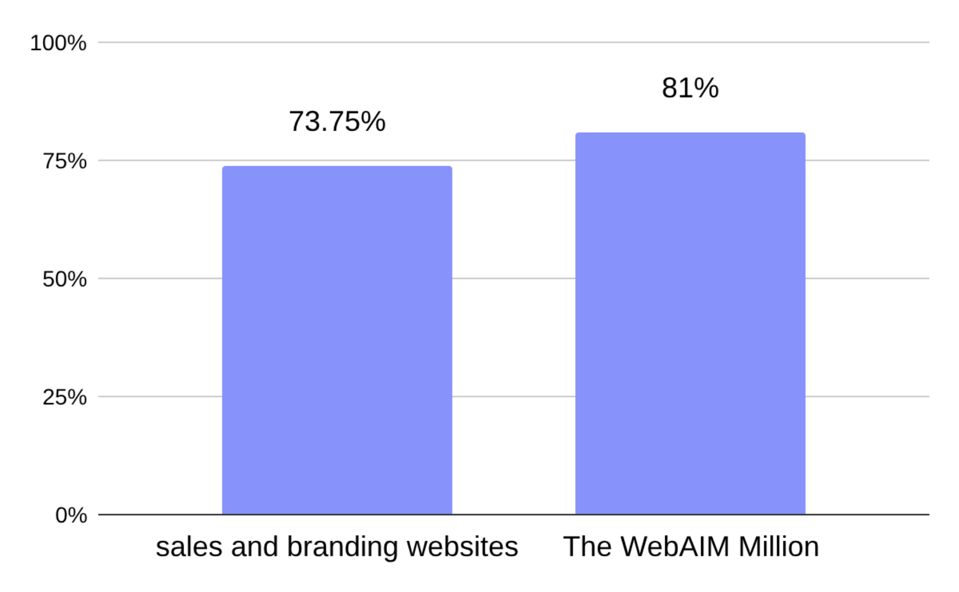
Percentage of websites with contrast problems: our sales and branding websites research vs. The WebAIM Million
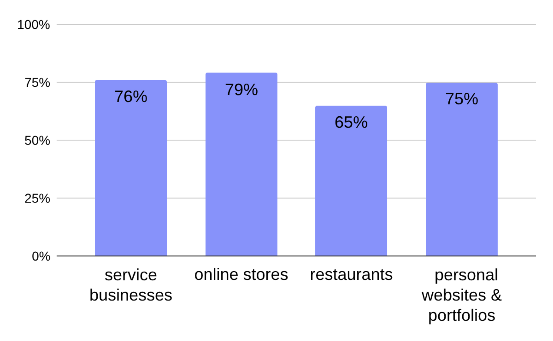
Our study found that 73.75% of sales and branding websites have contrast problems. While this is slightly lower than the 81% identified in WebAIM’s study of high-traffic websites, it still represents a significant problem. Here’s how the numbers break down for different types of websites:
-
79%of store websites had low-contrast elements. -
76%of service business websites were affected. -
75%of personal websites and portfolios showed contrast issues. -
65%of restaurant websites had low-contrast issues.
These findings highlight that, while there are variations among different types of websites, contrast problems remain a widespread challenge across the board.
Percentage of websites with contrast problems: different types
How many contrast errors are the "norm"?
The average number of low-contrast elements per page, according to WebAIM’s Million study, is 34.5. In our research, which focused on smaller business and personal websites, the average was notably lower at 12.32 errors per page.
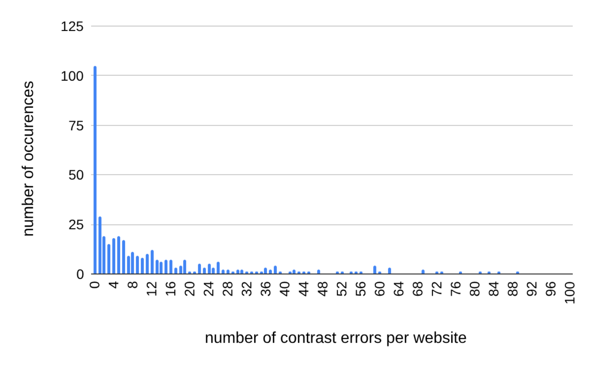
Number of contrast problems on sales and branding websites in relation to the frequency of occurrences
But averages don’t always paint the full picture. Medians provide a clearer view of the typical website and suggest that smaller sites often have fewer elements overall, which helps keep the error count down:
-
9 errors per pagefor service business websites. -
6 errors per pagefor store websites. -
5 errors per pagefor personal websites and portfolios. -
2 errors per pagefor restaurant websites, making them the standout performers.
What could explain the differences between the findings of the study on the most popular websites and our own? One factor might be the size of the websites – the most popular websites in the world are often highly complex and larger in scale than independent business sites or portfolios, which could lead to a higher number of errors. On the other hand, these top websites belong to major entities that should, in theory, place a high priority on professionalism and accessibility.
Used colors and color contrast
This is a controversial one – some colors are better than others, at least when used as backgrounds or text colors. For a few of the most commonly used colors (link to blog about colors), the percentage of low-contrast elements looks as follows:
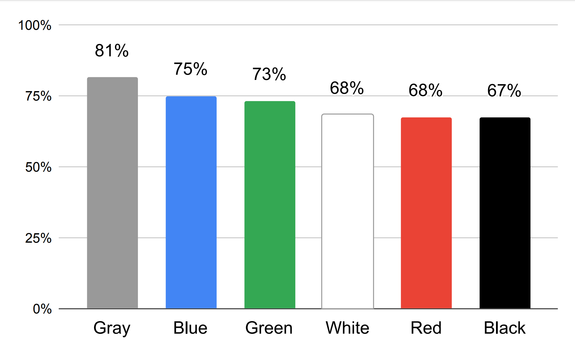
Percentage of contrast problems for websites with different dominant colors
The highest number of contrast errors occurred on websites where gray was the dominant color. And it’s no surprise – gray shades fall between white and black, making them inherently harder to contrast. No wonder elements on such pages are hard to see in black and white (pun intended – again).
Websites with white or black as the dominant color performed significantly better. That’s because combining these two creates the highest possible contrast. So why didn’t websites with a dominant white or black color achieve an exceptionally low rate of contrast issues? Well, maybe instead of pairing black and white with each other, designers paired these colors with gray… leading to less-than-ideal results.
How low contrast negatively impacts business?
We already know why low contrast on websites is problematic and how frequently it occurs in business-related sites. Now, it’s time to discuss the real consequences of contrast errors for entrepreneurs and their bottom lines.
Impact on sales
-
Missed opportunities with customers with disabilities: This one’s obvious – if your site isn’t accessible, you exclude a significant portion of potential customers.
-
Frustration and abandonment: Poor readability and perceived lack of professionalism lead users to leave your site, often for a competitor’s.
-
Overlooked CTAs and key elements: Critical actions like contacting you, completing a purchase, or engaging with content can be easily missed if they lack sufficient contrast.
Impact on SEO and rankings
-
Lower usability scores: Search engines deprioritize sites that don’t meet accessibility norms, lowering their visibility.
-
Reduced dwell time: Frustrated users leaving your site quickly signals to search engines that it isn’t user-friendly, further hurting your ranking.
Potential legal risks
If your website doesn’t meet accessibility standards, you could face lawsuits. In the U.S., lawsuits citing the Americans with Disabilities Act (ADA) are increasingly common. Consequences include legal fees, fines, and reputational damage.
Summary: good contrast pays off
Low contrast on websites isn't just a design flaw – it's a business risk. Here's a quick recap of why contrast matters and what we found in our research:
-
Contrast errors are common: In our study,
73.75%of sales and branding websites had contrast problems. While this is slightly better than the81%found in WebAIM's research on the most popular websites, it's still a widespread problem. -
Restaurant websites perform best: Among sales and branding sites, restaurant websites stood out, with only
65%containing contrast issues. -
Shades of gray are a risky choice. Love gray? Be sure to check the contrast first.
Improving contrast isn’t just about compliance; it enhances usability, reduces user frustration, and improves search engine rankings. Test your designs with a contrast checker to catch issues early—or make it effortless with our website generator, where contrast is already taken care of.
The data and statistics presented in this blog post come from a research study conducted by IKOL between 2023 and 2024. To learn more about IKOL research methodology and explore other findings, visit: ikol.com/research