What Is a CTA? A Guide to Conversion Optimization for Business

Call to action (CTA) is a small button on a website, but it has a huge impact on conversions - that's the best way to summarize its role. In this article, we'll summarize everything a business owner should know about CTAs, share best practices, and present the results of our research conducted on over2,700 small business websites in the US.
First, let's start with the definition:
What is a CTA?
A call to action (CTA) is an element on a website that guides visitors toward a specific action.
Most commonly, a CTA on a website takes the form of a button.
Why CTAs matter for website conversions
CTAs are the primary factor in driving conversions on websites.
A quick explanation of what a conversion is:
A conversion is any desired action a visitor completes on your website that supports your business goals.
Every webpage has a goal. In the case of business websites, that goal is to generate leads or acquire customers. For a website visitor to become a lead or a customer, they need to take action - contact the business, book a service, or make a purchase. In other words, they need to complete a conversion.
So, how do you increase conversions? You need to optimize your website for conversions.
Conversion Rate Optimization (CRO) is the process of improving a website so that more visitors complete a desired action, such as contacting a business, making a purchase, or booking a service.
Conversion rate optimization consists of clearly communicating your value proposition, building trust, reducing friction, and, of course, using effective CTAs.
How to create an effective CTA?
An effective CTA clearly communicates the next step, stands out on the page, and reduces friction to encourage conversions.
When creating a CTA for a website, follow these best practices:
- Be specific. Tell the user exactly what will happen after clicking. Better than “Click here" is “Book a consultation" or “Get a free quote".
- Keep it short and clear. A CTA should be 2–5 words long.
- Reduce friction. Lower user concerns - think about what might make them hesitate. On the CTA button or in its immediate vicinity, you can include messages like “No Credit Card Required", “Free Consultation", or “Cancel Anytime".
- Make your CTA visible. The CTA should stand out from the rest of the page through color (there is no single best color - the key is contrast, which makes it noticeable). It should also be placed in the right location - we’ve prepared a full section on this: “Where is the best place to put a CTA".
What are the types of CTAs?
CTAs can be categorized as primary or secondary based on their importance, and by their purpose, such as lead generation and retention, booking, transactions, or engagement.
First, let’s explain the different CTA goals:
- Lead generation & retention - collect user contact information; “Contact us", “Get a quote", “Call now", “Join our newsletter"
- Booking - mainly used by service businesses; “Book now", “Reserve a table"
- Transaction - lead directly to a purchase; “Add to cart", “Order online"
- Engagement - encourage visitors to explore the website; “Learn more", “See details"
In our research, we set out to examine which types of CTAs are most commonly used on the homepages of US small businesses across different industries. We focused on CTAs that directly drive conversions and excluded engagement-focused CTAs. Cart buttons from e-commerce websites were also excluded, as they are a standard feature of online stores and would have resulted in a 100% occurrence rate. Next, we categorized found CTAs into the following types:
| CTA type | What the CTA does |
|---|---|
| contact | leads to a contact page or form |
| phone | opens a phone calling app |
| opens the email client | |
| booking | redirects to online scheduling |
| order | leads to checkout or an offer page |
| registration | allows customer to create an account or log in |
| quote | leads to a quote request form |
| donation | lets visitors make a donation (sometimes used on websites that also engage in charitable activities) |
The findings probably won't come as a surprise: the types of CTAs used vary considerably depending on the industry. 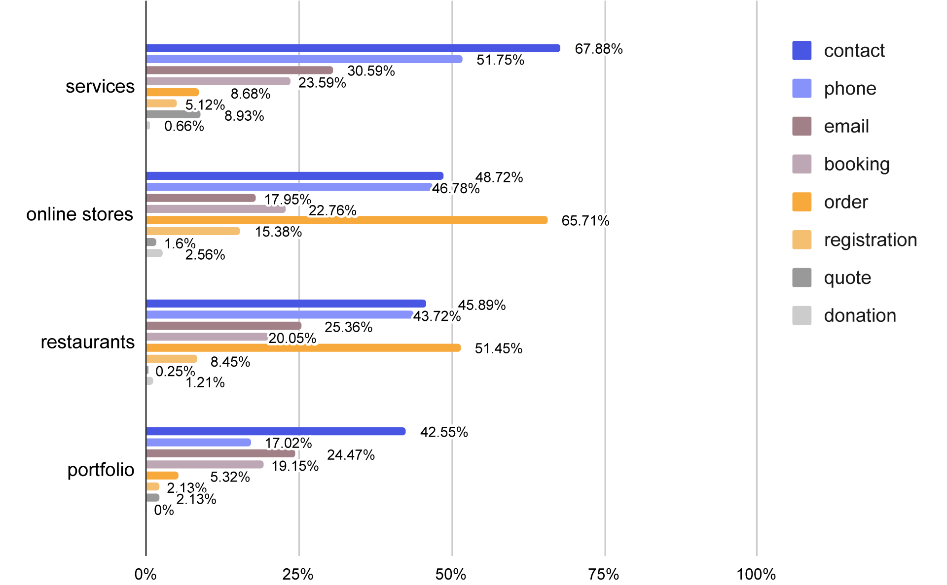
Distribution of different CTA types across small business websites in the US
Service-based business websites most commonly featured contact CTAs (67.88%) and phone call CTAs (51.75%).
On e-commerce homepages, the most common CTA was “order" (65.71%). Next, 48.72% of store websites featured a contact CTA, and 46.78% included a phone CTA. It is worth noting the relatively high share of registration CTAs compared to other business types, which appeared on 15.38% of store homepages.
Restaurant websites showed a similar pattern to e-commerce sites, 51.45% of restaurant homepages included an order CTA, 45.89% a contact CTA, and 43.71% a phone CTA.
Portfolio websites most commonly featured contact CTAs, which appeared on 42.55% of homepages.
Where is the best place to put a CTA?
CTAs should be placed where visitors naturally reach a decision point, such as the hero section, after key content, and at the end of the page.
There is one absolute rule - a CTA should be placed above the fold, meaning in the part of the page that is visible immediately after loading, before the user scrolls. According to Webdesigner Depot:
CTAs above the fold are 73% more visible.
Beyond this rule, CTA placement should follow the context of the content. Here are the strategic homepage locations where CTAs should be placed:
⬆️ Hero
This is the above-the-fold section, right below the navigation. This section is the essence of the page in a nutshell - it tells the user where they are and “what we want from them." And what we want is conversion, which means we need a CTA. In the hero section, a CTA is essentially mandatory.
It is also worth noting that the composition of the hero section matters not only aesthetically but also in terms of performance. According to research conducted by the company VWO:
CTAs surrounded by less clutter and more white space can increase conversion rates by 232%.
🛒 After presenting the offer
Once you explain what the company offers, what problems it solves, and what benefits it provides - it is time for another CTA.
⭐ After trust-building sections
To convince a customer, a good offer is often not enough. Trust signals such as customer reviews, company success metrics, certifications, or partner logos can help. After sections that demonstrate trustworthiness, it is a natural moment for conversion and a CTA.
⬇️ End of the page
The user has read the entire page - now you need to guide them somewhere, ideally by suggesting an action through a CTA button. A CTA at the end of the page can be the same as the CTA after the offer or trust sections, depending on how the page is structured.
🧭 Navigation
Navigation is a unique element of a website - not only is it part of the above-the-fold area, but it is also always visible. Placing a CTA there creates a strong opportunity. According to Conversion Rate Experts:
A sticky call to action improves sales by 25%.
The most common navigation CTA is a contrasting button placed on the far right of the navigation bar. It works best when there is only one CTA; sometimes two are used (but they must differ from each other). More than two CTAs no longer make sense, as they stop standing out from the rest of the navigation items.
A CTA in navigation can be included, but it is not required. On websites with customer accounts or in e-commerce stores that must include a cart button in the navigation, there is often not enough space left for a CTA.
How is It used in practice?
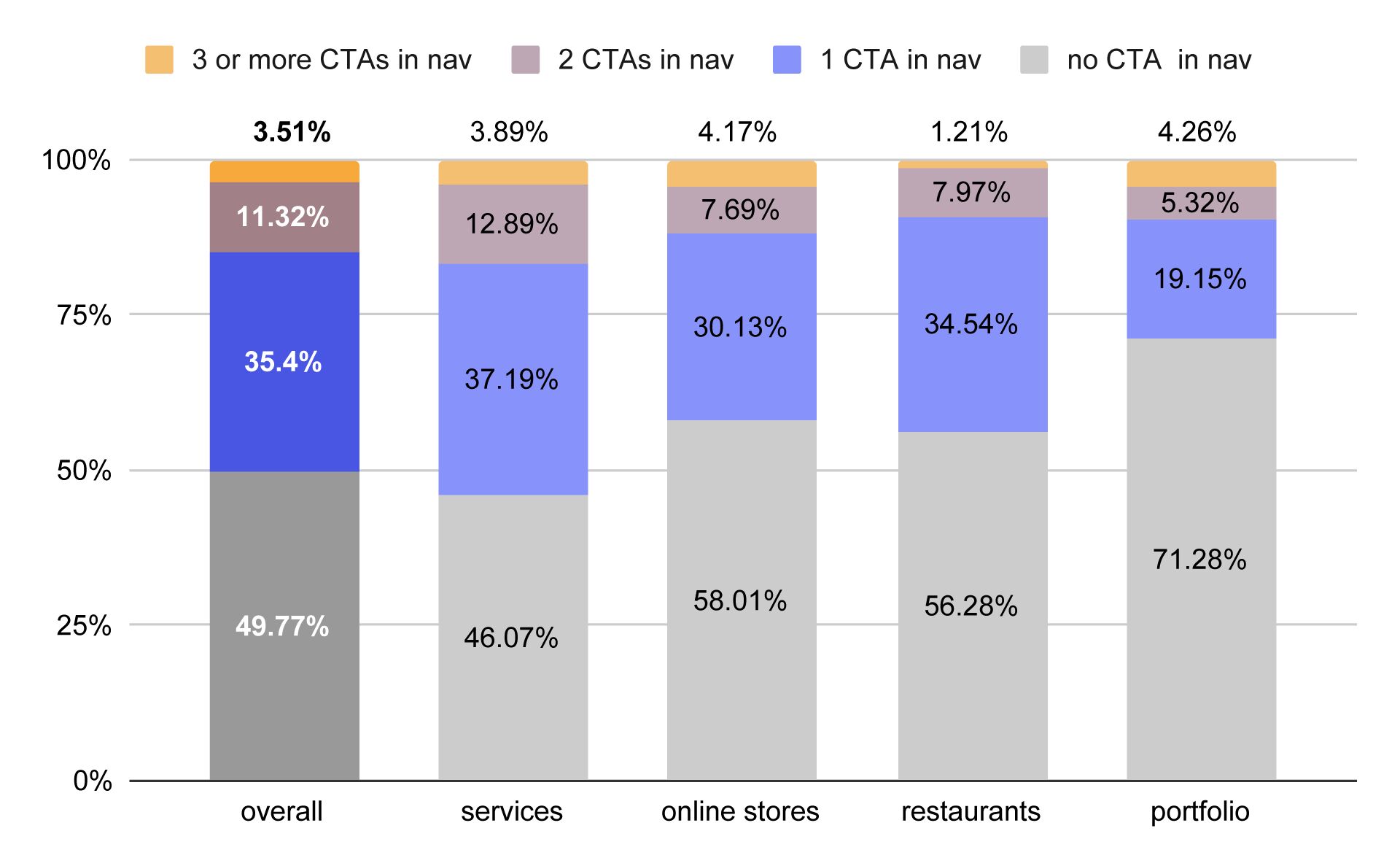
Presence of CTAs in navigation across small business websites in the US
On average, 49.77% of business homepages do not include a CTA in the navigation. A single CTA in navigation appears on 35.4% of homepages, two CTAs on 11.32%, and 3.51% have three or more CTAs in navigation (which is considered poor UX practice).
Different types of businesses varied in how often they used navigation CTAs. Among portfolio websites, navigation CTAs were the least common - as many as 71.28% of portfolio sites did not include a CTA in navigation. On the other hand, service-based business websites used navigation CTAs most frequently - 46.07% did not include one, while 53.93% did.
How many CTAs should be on a webpage?
A homepage typically includes around 3–6 CTA placements, while other pages usually perform best with 1–4 CTAs, depending on the page’s length and purpose, as long as they support a single clear goal.
There is no universal number of CTAs that works for every page. Instead, each page should have one primary conversion goal, with enough CTA placements to make the next step clear without overwhelming visitors.
- Homepage: 3–6 CTA placements. Repeat the same primary CTA throughout the page (e.g., in the hero section, after key content sections, and near the footer). A secondary CTA, such as “Learn More" or “View Pricing," can also be included if it is visually less prominent.
- Service page: 2–4 CTA placements. Visitors on these pages are already interested in a specific service, so include a CTA near the top, after explaining the service, and near the bottom.
- Product page: 2–5 CTA placements. The primary CTA (such as “Add to Cart" or “Buy Now") should always be visible, with additional opportunities after product information or customer reviews.
- Contact page: 1–2 CTA placements. The contact form itself is usually the primary CTA, so additional buttons are rarely necessary.
- Blog post: 1–3 CTA placements. Keep the focus on the content while offering a relevant next step, such as contacting your business, requesting a quote, or exploring related services.
Having fewer CTAs than recommended may not give visitors enough context to take actions that lead to conversion, while having too many can make the page feel cluttered and dilute its purpose, which can also negatively affect conversions.
In our study, we specifically analyzed the homepages of business websites. Here is what we found:
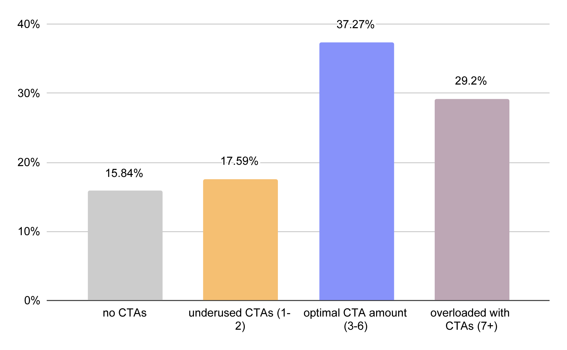
Distribution of CTA counts on small business homepages in the US
Our research shows that 37.27% of small businesses in the US stick to the optimal range of 3–6 CTAs on their homepage, 29.2% overuse CTAs, 17.59% use too few CTAs, and as many as 15.84% do not use CTAs at all.
When it comes to business types, we calculated the median number of CTAs on homepages to better illustrate typical usage patterns:
| Business type | Median homepage CTA count |
|---|---|
| services | 4 |
| stores | 4 |
| restaurants | 4 |
| portfolios | 1 |
Service-based businesses, online stores, and restaurants most commonly have 4 CTAs on their homepage. Portfolio websites stand out in comparison, typically featuring only 1 CTA on the homepage.
Frequently asked questions on CTAs
Can a website have too many CTAs?
Yes. Too many competing CTAs can overwhelm visitors and make it harder for them to decide what to do next. It's usually better to focus on one primary conversion goal and repeat it throughout the page.
What's the difference between a primary CTA and a secondary CTA?
A primary CTA is the main action you want visitors to take, while a secondary CTA offers an alternative next step. The primary CTA should be more visually prominent to guide users toward your main conversion goal.
Should a homepage have multiple different CTAs?
A homepage can include multiple CTA placements, but they should usually support the same primary goal. Too many different CTAs can dilute your message and reduce conversions.
What color should a CTA button be?
There isn't a universally best CTA color. The most effective CTA button is one that contrasts with the rest of the page and stands out without disrupting the overall design.
Can phone numbers and email links be considered CTAs?
Yes. Clickable phone numbers and email links encourage visitors to take immediate action, making them a type of call to action, especially on small business websites.
Which CTA appears most often on US small business websites?
On service business websites, the most common CTA was “contact", whereas on online stores and restaurant websites it was “order".
How many CTAs do US small business websites typically have?
Our analysis found that the median US small business homepage contains 4 CTA placements.
Turning CTA insights into real website performance
CTAs are one of the most important elements influencing website conversions, yet our analysis of over 2,700 US small business websites shows that their implementation is often inconsistent. Most effective websites rely on a single primary conversion goal, reinforced through a small number of well-placed CTA elements across the homepage.
At the same time, many businesses either overuse CTAs or fail to structure them in a way that aligns with user intent and page flow. This suggests that knowing what a CTA is is not enough - the real challenge is deciding where it should appear, how often it should be repeated, and how it should differ depending on the type of business.
This is exactly why structured, data-driven approaches to CTA placement matter. Tools like IKOL are designed to remove this guesswork by helping businesses automatically align their website structure with proven conversion patterns across industries - ensuring that CTAs appear in the right places, with the right intent, for the right audience. Try IKOL for free and discover how easy it is to build a conversion-focused website.