Business Colors Online: How To Choose The Right Palette?

So… how are you feeling about colors? Maybe you’re just starting out, trying to figure out how to make your website look polished and professional. Or maybe you’re a seasoned designer who’s been through countless palette choices. Either way — we’ve got something fresh for you. In this post, we’ll break down the theory behind choosing website business colors and show you exclusive data insights from over 2,600 business websites. So grab a coffee and let’s start from the beginning!
UI color basics: palette structure & distribution rules
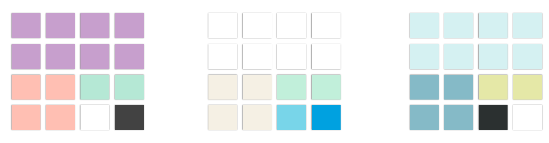
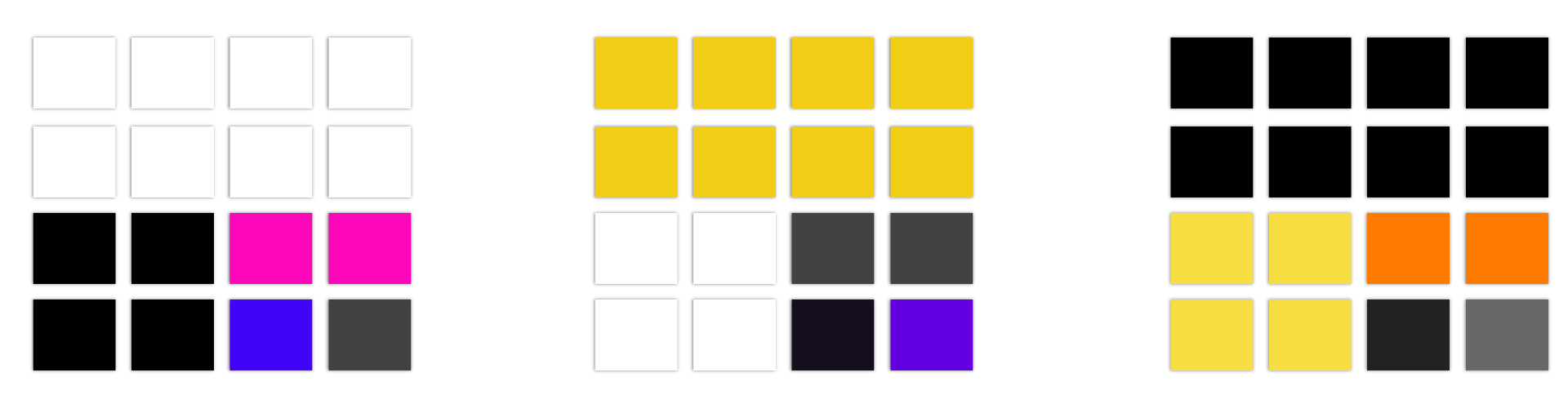
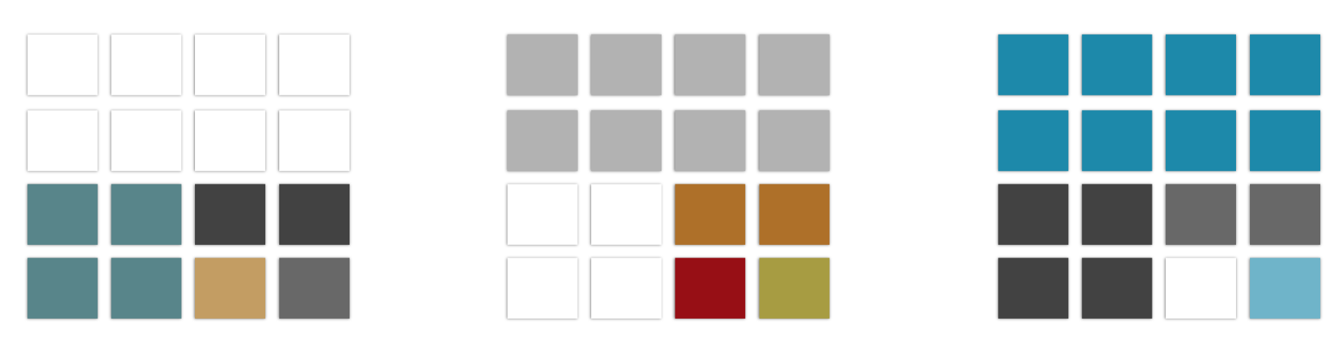
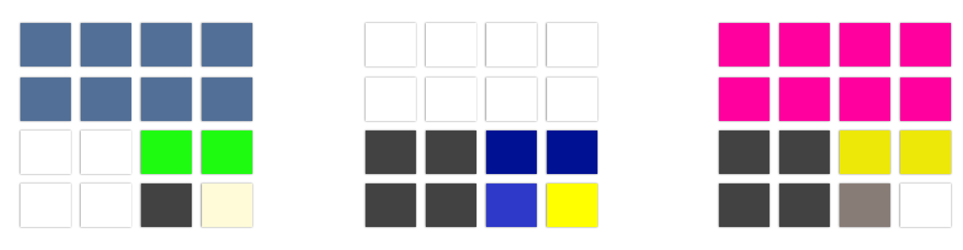
Before we dive into the stats, let’s go over the building blocks. A well-designed UI color palette usually consists of three main components: primary, secondary, and accent colors.
What are primary, secondary, and accent colors in UI?
According to UI principles, a website color palette should b limited and intentional. Most designers agree that three key colors are ideal, each with a distinct purpose:
Primary color
Let’s start with something less flashy, but absolutely essential — the primary color. This is the color that covers most of the space on your website: backgrounds, surfaces, large blocks. Often, it’s not one of the brand’s business colors but rather part of a neutral color palette — soft grays, beiges, or muted tones — designed to let the other elements shine. These kinds of neutral colors help create a calm, professional backdrop that feels effortless and clean.
💡Tip:
Avoid pure white or absolute black as your main background. These extremes can strain the eyes due to harsh contrast. Instead, opt for tints and shades of white and black — subtle off-whites or dark grays work much better.
Secondary color
Your secondary color is there to contrast with the primary one. It’s the color that appears in components like cards, headers, footers, or sidebars. Often, it’s one of the brand’s business colors, closely associated with the company’s identity. But not always. Sometimes it simply serves as a visually pleasing element that fills a large portion of the palette and brings balance to the overall design.
Accent color
This one is optional but powerful. Accent colors often show up in call-to-action buttons, highlights, or other interactive elements. This is where a bright color palette can make a big impact — guiding the user’s attention and reinforcing the brand’s tone.
Typography and iconography
Colors don’t stand alone. Typography and iconography also play a key role in your website’s feel. Fonts and icons are typically neutral — blacks, grays, or whites. This ensures they don’t clash with other elements and remain readable. But you can also experiment with slight tints or subtle gradients to make typography feel modern and fresh. Just don’t overdo it.
What is the 60-30-10 rule? And do websites actually use it?
The 60-30-10 rule is a classic design principle. According to this rule, in any visual composition, 60% of the area should be occupied by the dominant (primary) color, 30% by the secondary color, and 10% by the accent color.
But does this rule hold up in real life? We checked. In our study of over 2,600 business websites, the numbers came close, but not exactly:
-
The primary color covered on average
66.28%of the homepage. -
The secondary color took up around
15.36%. -
The third color, usually the accent, accounted for about
4.24%.
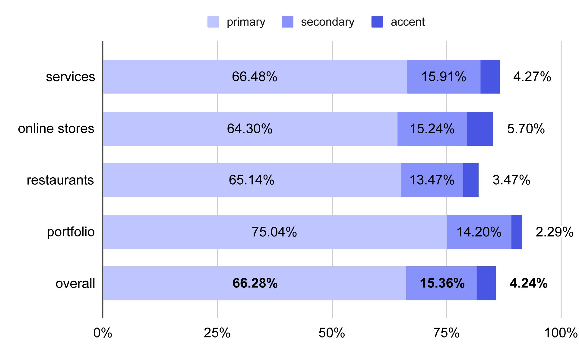
Share of website surface taken up by the top 3 colors, shown as a percentage of total page area.
As you can see in the chart above, these percentages don’t add up to 100%. The rest of the space was filled with additional colors, probably coming from images, overlays, or background gradients outside the core palette — a reminder that even the best website color schemes are influenced by more than just solid blocks of color.
What is color harmony on a website?
Color harmony refers to sets of colors that complement each other visually. Harmonious palettes create a balanced, pleasing look. There are several common types of color harmony used in design. We not only analyzed their definitions but also checked how frequently business websites use them — and how they fit into the best website color schemes across different industries.
Monochromatic & grayscale palettes
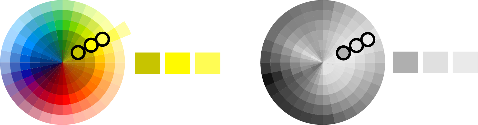
A monochromatic palette consists of different tints and shades of the same hue. For example, a candy shop website might stick to variations of magenta, from pale pinks to deep purples.
Grayscale palettes are a special case of monochromatic harmony — just black, white, and everything in between. They’re often used in minimalistic designs or in portfolios where visuals (like photos) should take center stage. In our data, grayscale palettes were surprisingly popular. For instance, 66% of modeling portfolios used grayscale, emphasizing content over decorative elements. When a website doesn’t have established business colors — and therefore no need to build the design around brand-specific hues — a grey color palette can serve as a neutral color palette that lets the content shine without requiring complex color coordination.
Analogous palettes

Analogous palettes are made of colors that sit next to each other on the color wheel. These combinations feel natural and smooth, creating gentle transitions and visual harmony.
A great example we found in our research: African cuisine restaurant websites. About 3o% of them used warm, earthy analogous colors like yellows, oranges, and reddish browns — evoking a sense of warmth and tradition.
Complementary palettes
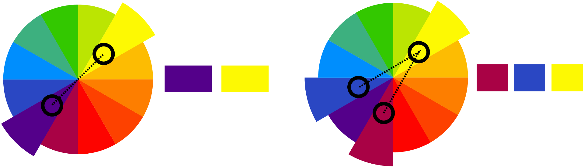
Complementary palettes are built from colors that sit opposite each other on the color wheel, creating strong contrast. This can include variations like split complementary palettes. In our data, complementary palettes showed up in industries like boating and marine stores — 50% of these sites paired blues with vibrant reds or yellows, reflecting the nautical theme.
We also considered more complex harmonies like triadic or tetradic palettes, but these were almost nonexistent in our sample. Instead, we found plenty of palettes that didn’t fit any standard harmony category.
Non-harmonious palettes — or simply contrasting?

Some palettes don’t follow traditional harmony rules at all. These often rely on neutral backgrounds with a single strong accent color — sometimes taken from a bright color palette to create contrast and clarity. It could be a conscious minimalist choice — or sometimes just a quick, utilitarian decision. In many cases, these sites prioritize function over creative exploration of color.
In fact, this type of contrasting palette dominated almost every industry in our research. It seems that many business websites go for simplicity rather than elaborate color systems.
What color harmonies do business websites actually use?
To answer this question, we categorized all the palettes in our study. Here’s what we found:
-
61%of websites used non-harmonious or simple contrasting palettes. -
Grayscale was the second most common at
26.9%. -
Complementary palettes made up
6.7%. -
Palettes that included analogous colors accounted for
3.1%. -
Monochromatic palettes were the least common, at just
2.37%.
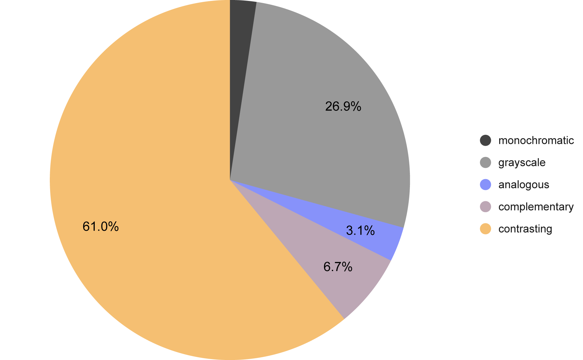
Distribution of color harmony types across business websites
Let’s take a closer look at how these results differ by website type. Portfolios stood out the most. In this category, grayscale palettes outnumbered contrasting ones — which makes perfect sense. Portfolios are meant to showcase work without distractions. A neutral background or a grey color palette helps content shine by staying out of the way and maintaining visual balance.
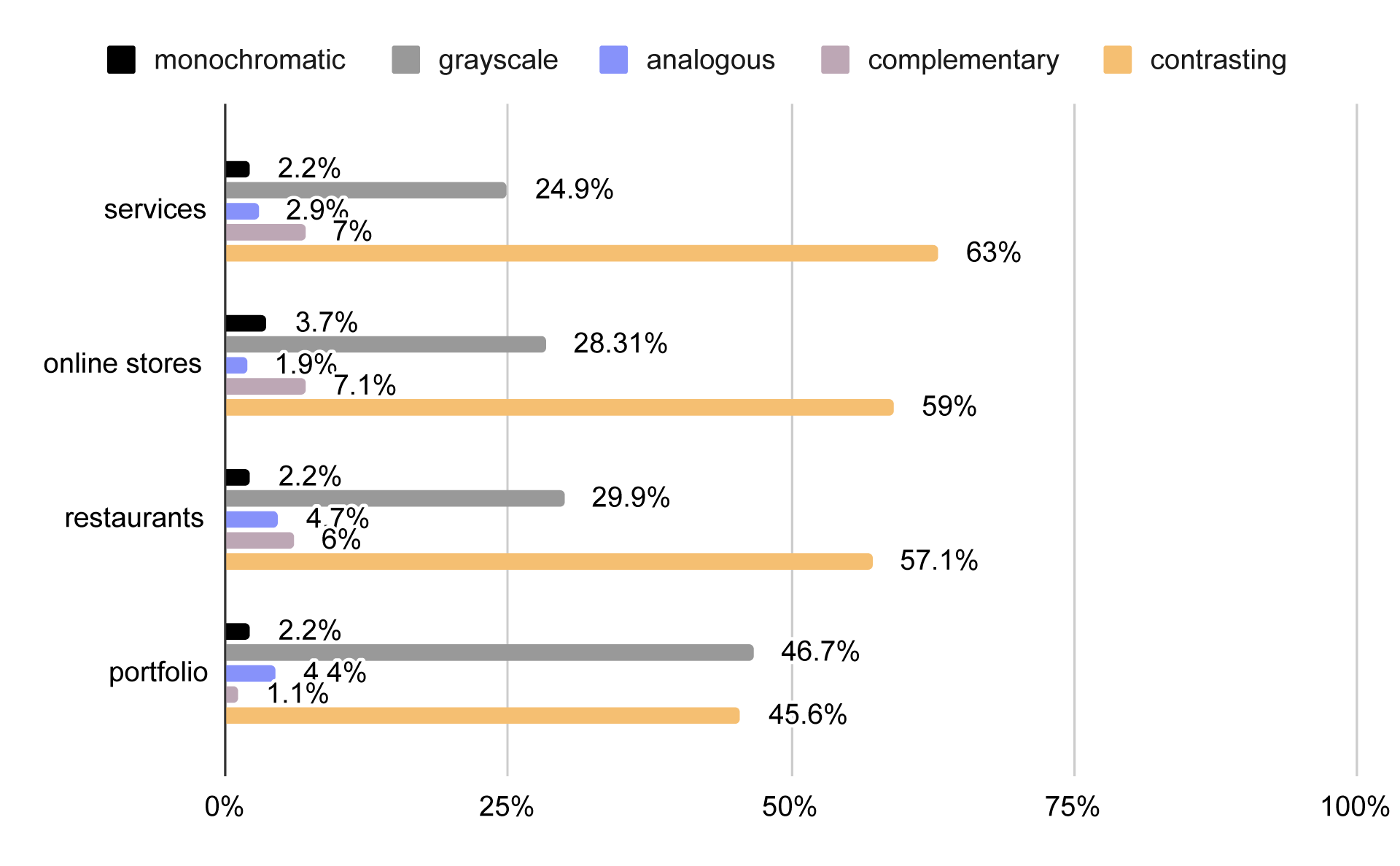
Color harmony types by business website category
Other business website types showed less variation from the overall averages, but the tendency toward simplicity and practicality remained clear across industries.
Warm or cool? How business uses color temperature in web design
While color harmonies might sound like something out of an advanced design course, chances are you’ve already heard about warm and cool colors. These two categories are simple but incredibly powerful when it comes to influencing how a website feels — and choosing the right business colors often starts right here.
Warm palettes
Warm palettes are filled with colors that evoke warmth, energy, and light. Think reds, oranges, yellows, warm browns, and touches of gold. These earth tones colors are dynamic, attention-grabbing, and often associated with comfort, friendliness, and positivity.
Cool palettes
Cool palettes lean into calmness, distance, and professionalism. They’re built from shades of blue, green, violet, silver, and cool grays. These colors bring elegance, tranquility, and trustworthiness — though they can also feel more reserved or distant.
We classified the websites we analyzed based on color temperature. Here’s what we found:
-
Cool palette:
32.4% -
Warm palette:
28.9% -
Mixed palette:
17.2% -
Neutral color palette:
21.5%
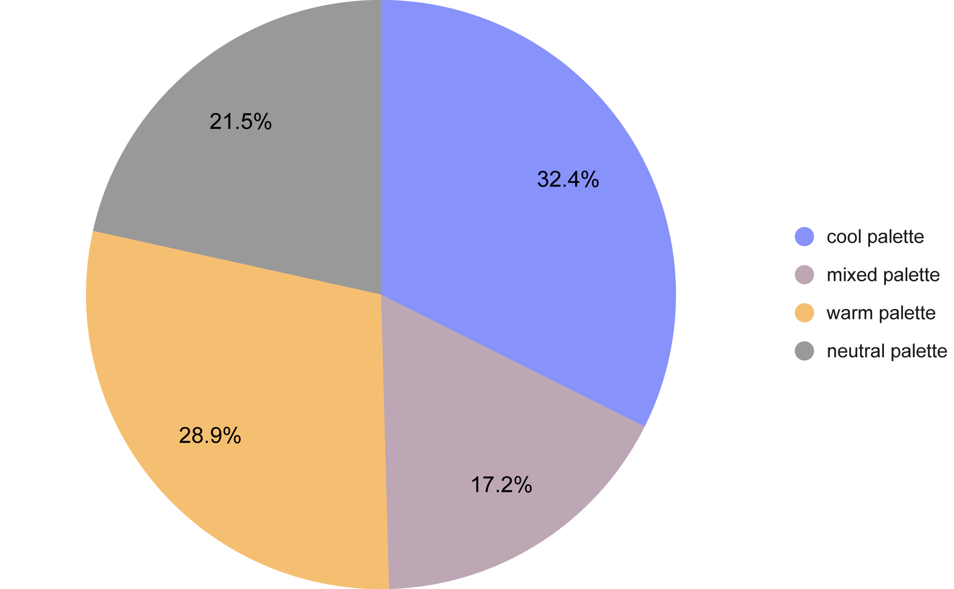
Share of websites using warm, cool, mixed, or neutral palettes
There were notable differences by website type. Service-based business websites skewed colder (36.5%), aligning with the desire to convey professionalism and reliability.
Restaurant websites, on the other hand, were noticeably warmer (42.4%), which makes sense — warm colors and earth tones colors can evoke enthusiasm and even stimulate appetite.
Palettes made of neutral colors had their biggest presence in portfolios, with 40% of those sites favoring minimal or grayscale design to keep the focus on content. In many of those cases, a grey color palette was used to support that minimalist look — subtle, versatile, and ideal for showcasing content without visual noise.
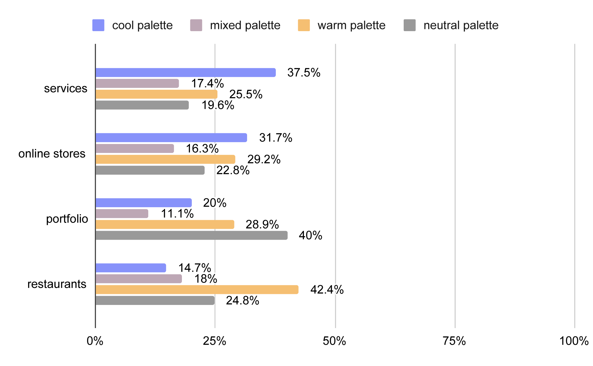
Share of warm, cool, mixed, and neutral palettes by website category
Overall, color temperature plays a key role in shaping business colors — helping define not just the visual style, but also the emotional tone and perceived trustworthiness of a brand. Understanding this dynamic is essential when creating the best website color schemes that align with both function and feeling.
Palette styles
In addition to temperature and color harmony, palettes can also be categorized by saturation and tone. We identified several key palette types in our research — each offering different ways to express brand identity through business colors, and helping you understand what goes into the best website color schemes.
Pastel palette
Pastel palettes are made up of soft, light, and diluted colors that feel airy, gentle, and luxurious in an understated way. These are delicate hues with low saturation and lots of white added — think powder pink, mint green, baby blue, lavender, light peach, and soft yellow.
You’ll find pastel palettes frequently in beauty, wellness, lifestyle brands, children’s products, bakeries, and fashion blogs. They convey elegance, softness, and calm sophistication.
Vibrant palette

Vibrant palettes are bold, bright, and energetic. These colors are high in saturation, almost neon, and they command attention. A bright color palette like neon pink, lime green, or electric blue instantly creates a sense of excitement and modernity. While pastel or balanced palettes aim for softness and subtlety, a vibrant color palette is all about energy, confidence, and standing out — which is why it’s common in entertainment, fitness, or youth-oriented brands. Vibrant palettes scream, “I’m bold, fun, and I want to be seen!"
Deep palette

Deep palettes use dark, rich, and saturated tones that exude elegance, drama, and sophistication. Picture deep navy, dark burgundy, bottle green, plum purple, chocolate brown, and charcoal gray.
These palettes work well for premium brands, luxury products, and businesses that want to convey seriousness and refinement, from fine dining restaurants to law firms.
Bold contrasting palette
Bold contrasting palettes combine dark, intense shades with bright, vibrant ones for strong visual impact. Think dark navy paired with neon pink or deep purple with bright yellow.
These palettes are a favorite for brands that want to showcase creativity and fearless style — often used by tech companies, gaming brands, streetwear labels, and creative agencies. The message here is clear: “Look at me! I’m dynamic, daring, and unconventional."
Balanced palette
A balanced palette is calm, refined, and… well, balanced. These palettes stick to medium saturation, avoiding both extreme brights and overly muted pastels. You might see soft blues, warm beiges, muted greens, dusty reds, and gentle grays.
Balanced palettes often include soft blues, warm beiges, muted greens, and dusty reds — subtle versions of earth tones colors that create a grounded and composed look.
They are common among premium brands, law firms, boutique businesses, banks, B2B websites, and fine dining establishments. They say, “We’re mature, trustworthy, and composed."
Eclectic palette
Eclectic palettes embrace controlled chaos. These palettes can look like colorful randomness — a mix of different tones and saturations. Often, they still follow some kind of underlying harmony but aren’t afraid to push boundaries.
Eclectic palettes dominate creative spaces and signal bold personality. The “anything goes" approach can communicate innovation, spontaneity, and fun — and they’re a frequent choice when business colors aren’t strictly defined or when brand identity encourages creative freedom.
How common are these palette types?
Our research revealed the following breakdown across business websites:
-
Eclectic palette:
43.59% -
Deep palette:
30.74% -
Pastel palette:
20.44% -
Balanced palette:
3.87% -
Bold contrasting palette:
0.9% -
Vibrant palette:
0.45%
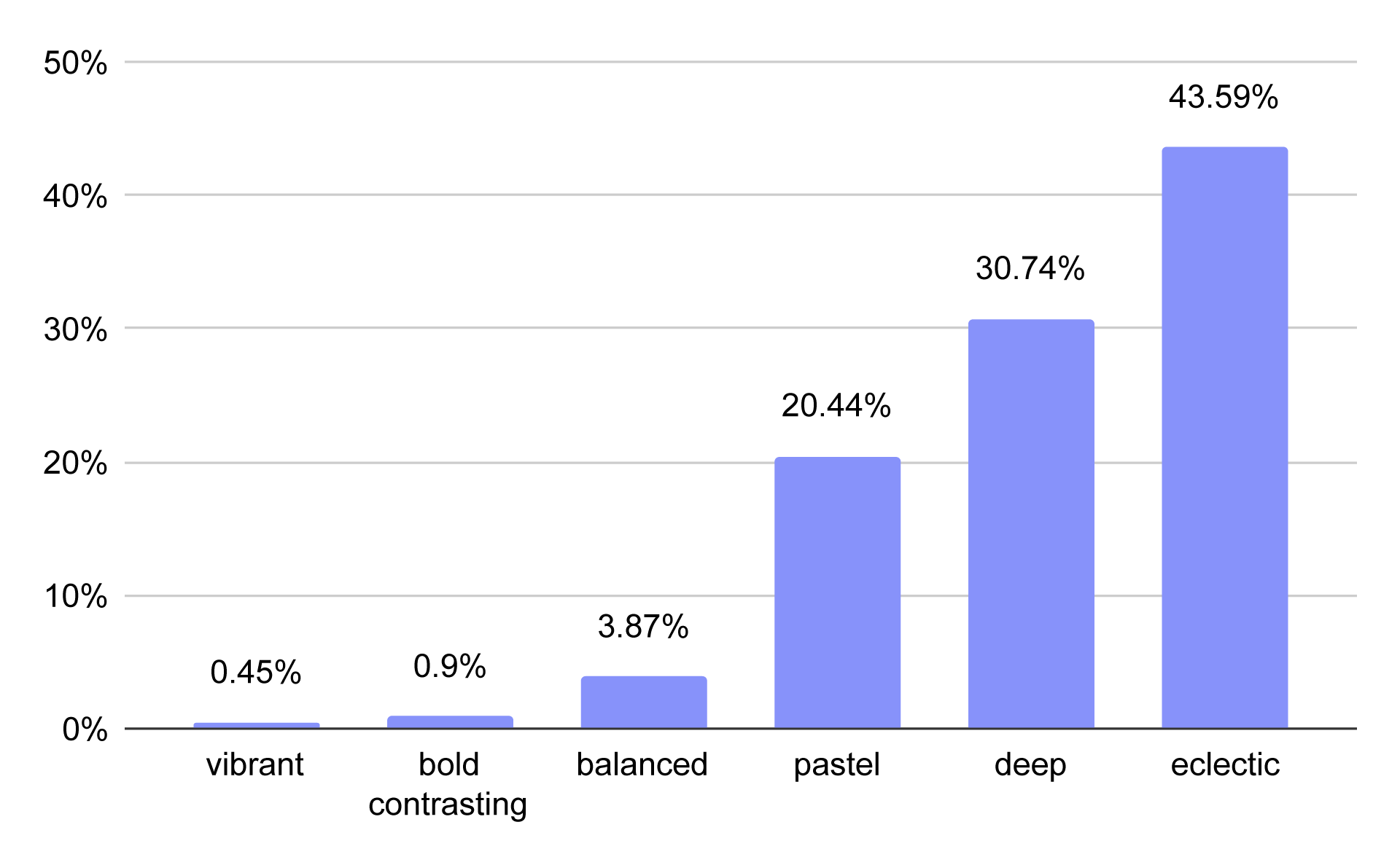
Distribution of color palette types across business websites
The clear winner overall is the eclectic palette. However, restaurant websites showed a strong preference for deep palettes, reflecting the rich, sensory nature of food experiences. Online stores, especially those targeting female shoppers or luxury items, leaned heavily toward pastel palettes.
What else should you know about business colors in UI?
1️⃣ Stay consistent: Use the same color for interactive elements like buttons and links to ensure users quickly understand what’s clickable.
2️⃣ Images matter too: Visuals contribute to your overall palette. Make sure photos and graphics harmonize with your site colors — especially when using schemes built around analogous colors, where subtle variations can easily clash if not carefully chosen.
3️⃣ Don’t forget accessibility: high contrast improves readability and usability, but too much contrast can be harsh. Our website generator and CMS take the guesswork out, offering palettes that balance beauty and readability.
To sum things up:
-
Most business websites opt for simple, often eclectic palettes rather than strict color harmonies — more likely due to a lack of intentional palette planning than a conscious design choice.
-
Color temperature matters: cool palettes convey professionalism; warm palettes evoke energy and comfort.
-
It's best to choose your palette type based on your brand’s personality and audience.
Need help designing a palette that works? Check out our website generator — it builds beautiful, accessible, and consistent color schemes for business websites. Try it 👉 here!