Best Fonts for Web Design: A Small Business Guide
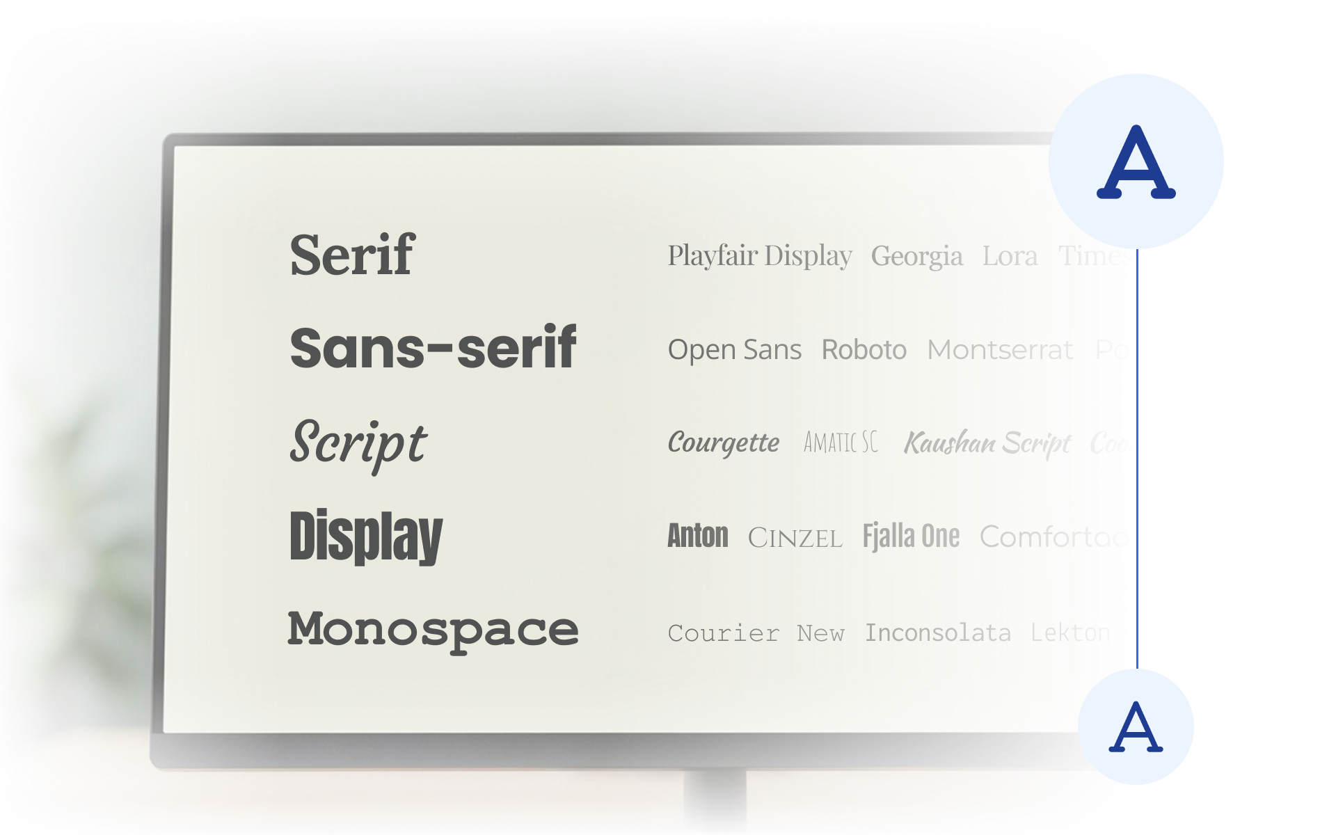
When you're running a small business, choosing a font probably isn't at the top of your to-do list. But typography affects much more than how your website looks. It influences how easy your content is to read, how your brand comes across, and even how efficiently your website loads.
In this article, we'll cover the most important aspects of website typography, explain best practices for choosing and implementing fonts, and compare them with data from our analysis of more than 2,700 U.S. small business websites.
What makes good website typography?
Good website typography should balance readability, visual hierarchy, brand identity, and technical performance.
But let's start by clearing up one common source of confusion.
Typeface vs. font
A typeface or font family is the overall design of a set of letters, such as Inter or Times New Roman.
A font is a specific version of that typeface, such as Inter Bold or Inter Italic.
On the web, however, the terms are often used interchangeably.
When choosing the best fonts for web design, it's easy to focus entirely on how a typeface looks, but it's better to take a more strategic approach and aim for:
📖 Effortless readability
High contrast and clear letterforms make text easier to read across different screens and sizes. The typeface should also fit your brand, so readability does not come at the expense of visual identity.
🎯 Clear hierarchy
Different font sizes, weights, and styles help visitors understand what is most important and scan the page quickly. A consistent hierarchy creates a clear visual flow from H1s and section headings to body text and supporting information.
⚙️ Technical optimization
A good typography system should use a limited number of fonts and only the files and weights that the website actually needs. Proper implementation also helps prevent unnecessary downloads, layout shifts, and slow text rendering.
Which font types do small business websites use most?
Sans serif fonts are by far the most common on small business websites - 74.55% use them in headings and 88.3% in body text.
But let's take it step by step, starting with the different font categories.
The simplest way to classify fonts is into serif and sans serif, but web design commonly uses five broader categories:
- Sans serif - clean and modern, without decorative strokes at the ends of letters.
- Serif - more traditional or elegant, with decorative strokes at the ends of letters.
- Monospace - every character takes up the same amount of space, creating a technical look.
- Script - designed to resemble handwriting or calligraphy, often creating a personal or elegant feel.
- Display - distinctive and decorative, designed to attract attention, especially in large headings.
We looked at how frequently these categories appeared in headings and body text across the websites in our study.
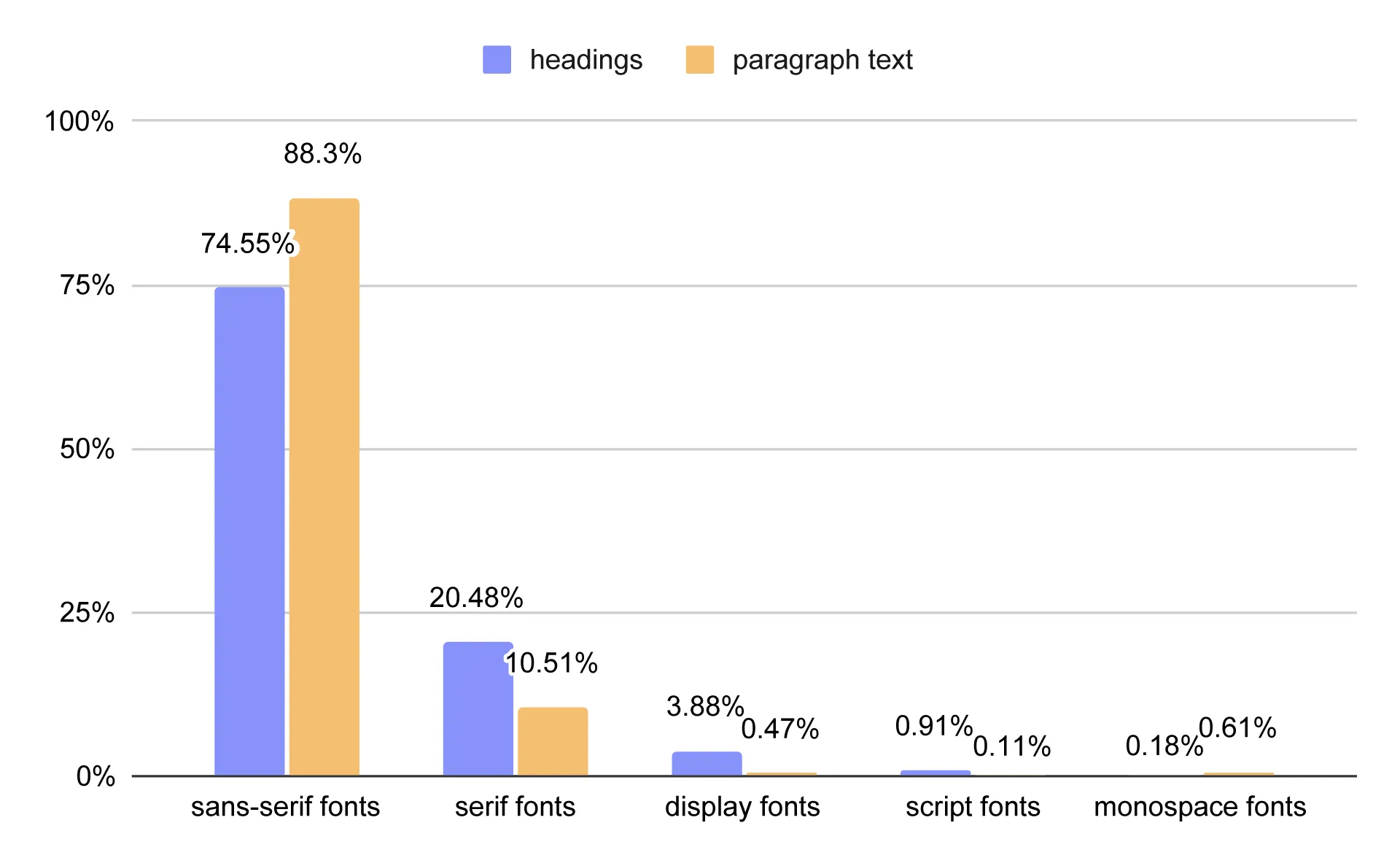
Font categories used in headings and body text across U.S. small business websites
Heading typography was considerably more diverse than paragraph text typography. This makes sense: headings are shorter, need to attract attention, and give designers more freedom to prioritize personality and visual impact.
Sans serif fonts were the dominant category in headings, appearing on 74.55% of small business websites in our sample. Serif fonts appeared in 20.48% of sites and were particularly common in industries where elegance, tradition, or a distinctive aesthetic are important.
For example, serif headings were used by 100% of bridal shops in our sample. Other industries with relatively high use included Chinese restaurants (71.43%), event planning businesses (66.18%), jewelry stores (66.67%), and steakhouses (62.5%).
Display fonts appeared in headings on 3.88% of websites. They were most common among restaurants overall (6.78%) and were particularly prevalent among sandwich shops, where they appeared on 37.5% of websites.
Script and monospace fonts were rare in headings, appearing on 0.91% and 0.18% of websites respectively.
Body (paragraph text) typography was much less diverse, largely because readability is the primary concern. Sans serif fonts dominated, appearing in the body text of 88.3% of websites, while serif fonts accounted for 10.51%.
The remaining categories were used only occasionally: monospace appeared on 0.61% of websites, display on 0.47%, and script on just 0.11%.
These results show that there is no single formula for choosing the best fonts for web design. Sans serif may dominate overall, but the right choice can look very different depending on the industry, brand, and role the typeface needs to play.
Which fonts are most popular on small business websites?
The most popular fonts on small business websites are Open Sans for paragraph text (10.25%) and Montserrat for headings (5.57%).
That’s the short version. We compiled a list of the 10 most popular fonts for headings and body text separately. Because headings and body text serve different purposes, we looked at their most commonly used fonts independently. We also looked at the most popular font combinations used for headings and body text.
What are the most popular heading fonts?
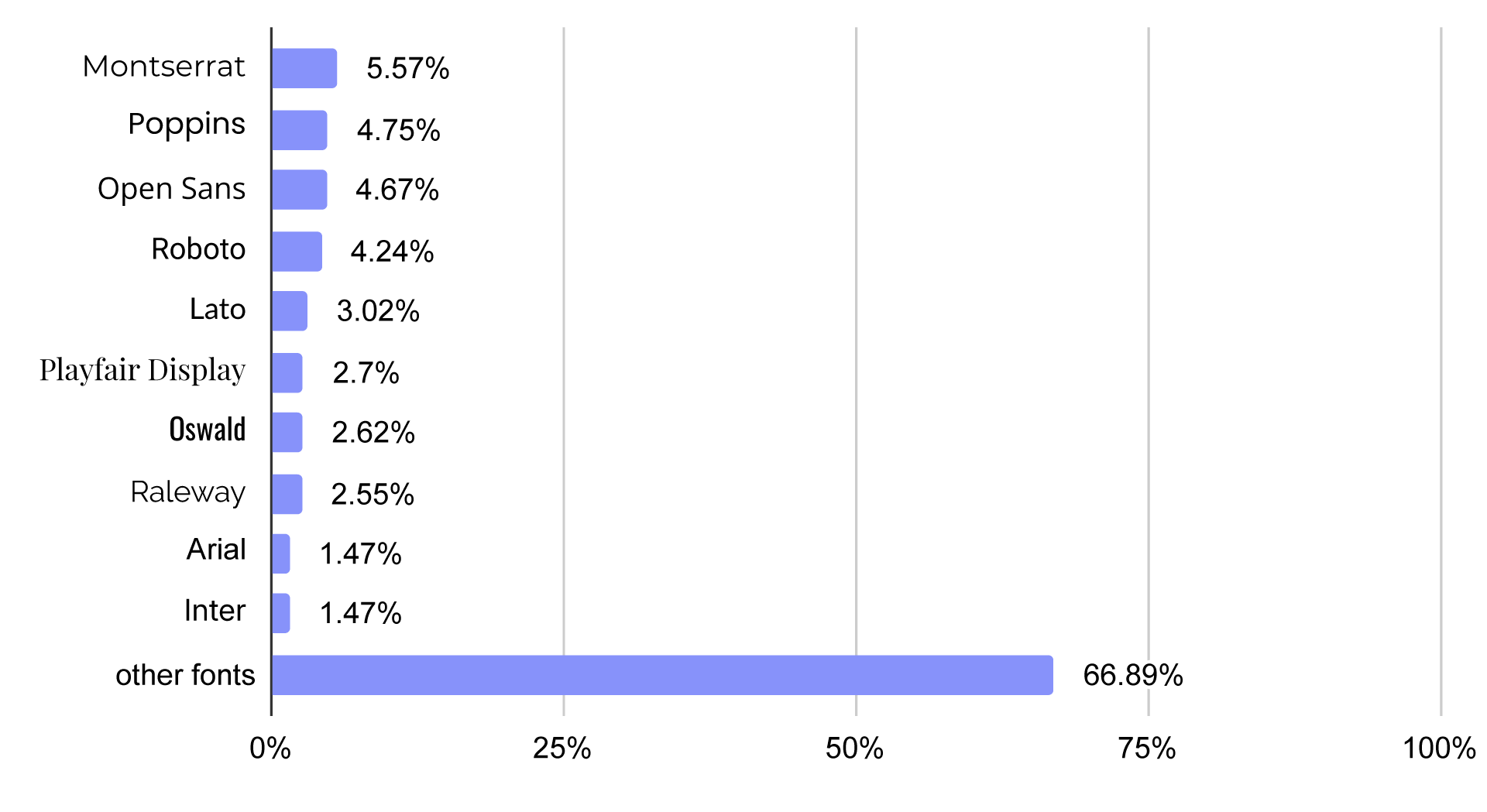
Most commonly used heading fonts on U.S. small business websites
The 10 most common heading fonts in our sample were:
- Montserrat:
5.57% - Poppins:
4.75% - Open Sans:
4.67% - Roboto:
4.14% - Lato:
3.02% - Playfair Display:
2.70% - Oswald:
2.62% - Raleway:
2.55% - Arial:
1.47% - Inter:
1.47%
Most of the top heading fonts were sans serif. The only serif font in the top 10 was Playfair Display, while Oswald was the only display typeface.
What are the most popular paragraph text fonts?
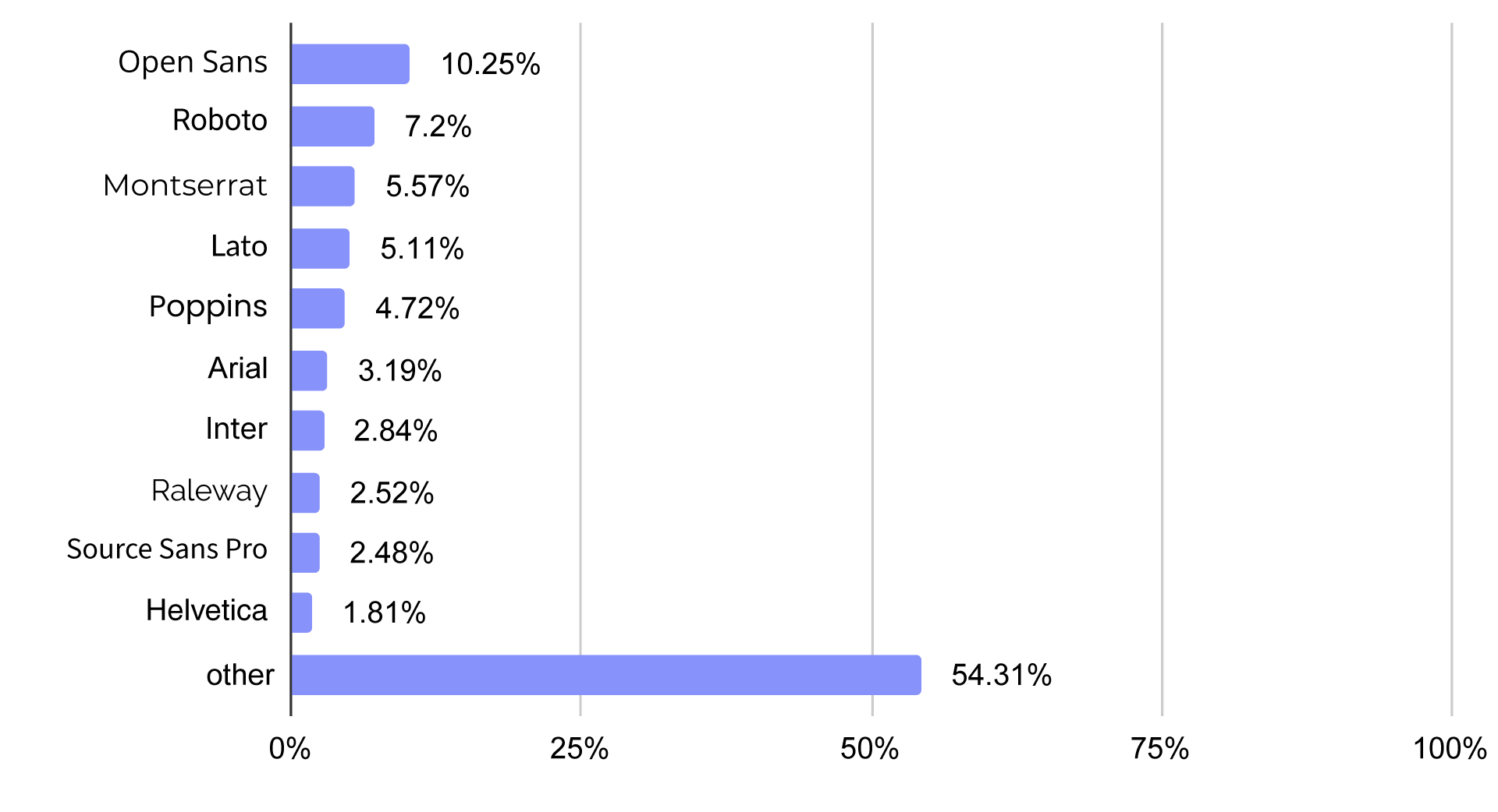
Most commonly used paragraph text fonts on U.S. small business websites
The 10 most common paragraph text fonts were:
- Open Sans:
10.25% - Roboto:
7.20% - Montserrat:
5.57% - Lato:
5.11% - Poppins:
4.72% - Arial:
3.19% - Inter:
2.84% - Raleway:
2.52% - Source Sans Pro:
2.48% - Helvetica:
1.81%
Unlike the heading list, all 10 of the most common body fonts were sans serif. That is not surprising: paragraph text has to prioritize readability, especially when visitors are reading longer sections of content or using smaller mobile screens.
What font combinations are most common?
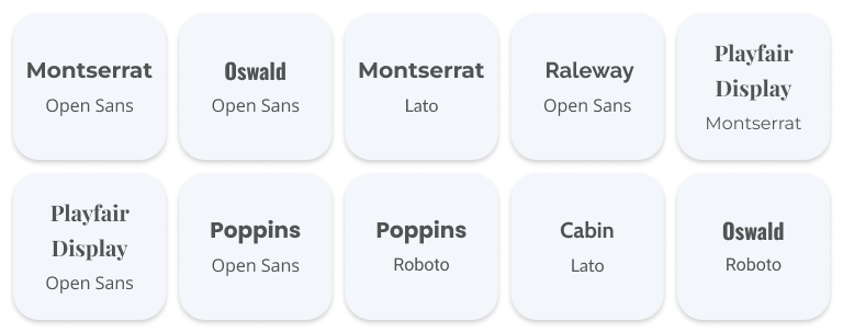
When we excluded websites using the same font family for headings and paragraph text, the most common combinations were:
- Montserrat + Open Sans
- Oswald + Open Sans
- Montserrat + Lato
- Raleway + Open Sans
- Playfair Display + Montserrat
- Poppins + Open Sans
- Poppins + Roboto
- Cabin + Lato
- Oswald + Roboto
These combinations illustrate a common approach to typography: a more distinctive typeface for headings paired with a highly readable sans serif for body text.
How many font families should a website use?
There is no need to use a large collection of fonts to create a distinctive website. For most small business websites, one to three font families is enough.
- One font family works when the same typeface is used throughout the website, such as Open Sans for both headings and body text.
- Two font families are useful when headings and body text need different visual characteristics, such as Playfair Display for headings and Open Sans for body text.
- Three font families can make sense in more specialized designs, for example when an additional font is used for a specific design element or icon system.
- In most cases, four or more font families are unnecessary and can make a website feel visually inconsistent.
We checked how many font families were used across the websites in our sample.
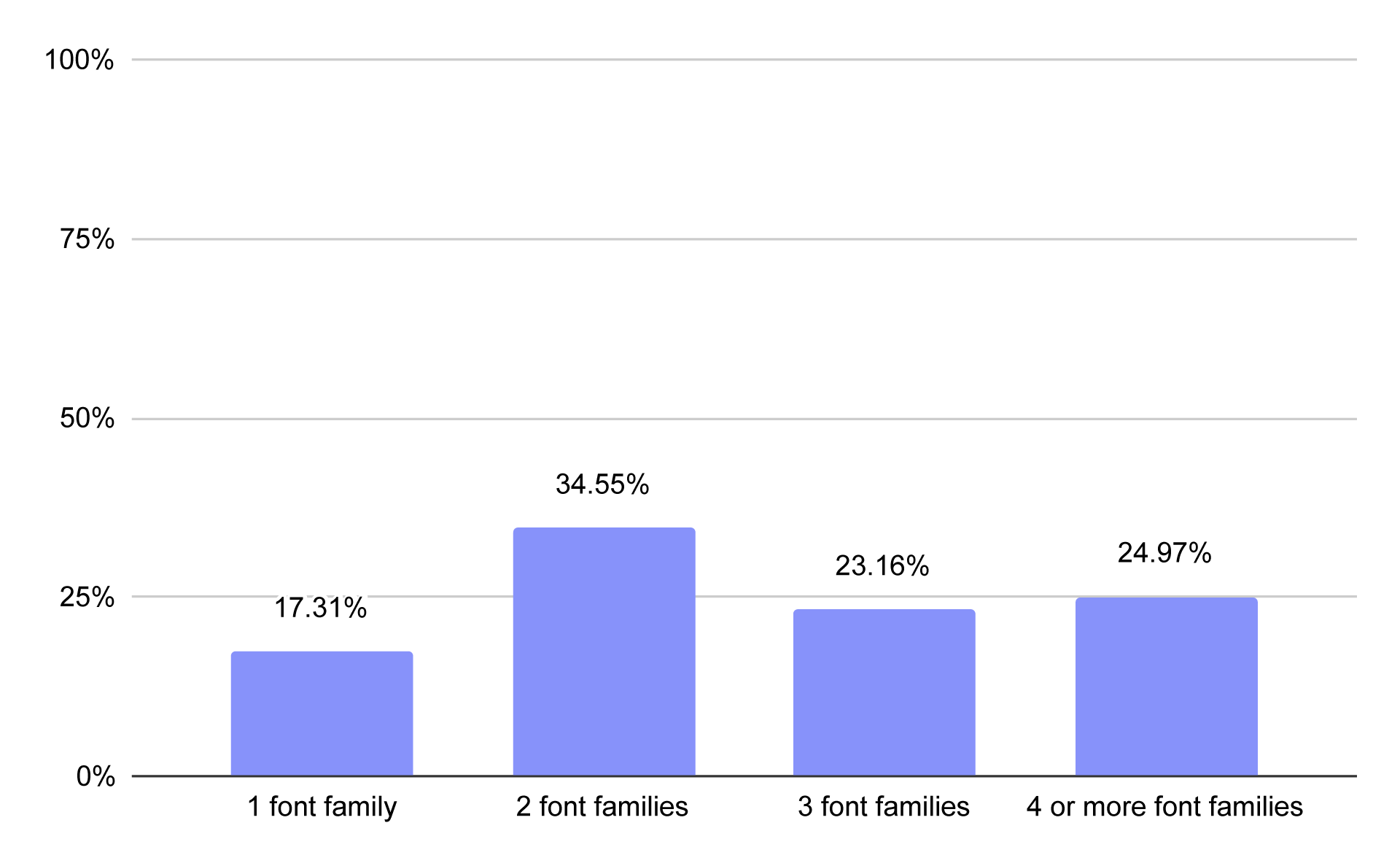
Number of font families used across U.S. small business websites
Among the small business websites we analyzed, 17.31% used one font family, 34.55% used two, 23.16% used three, and 24.97% used four or more.
The last number is particularly interesting because using four or more font families is rarely necessary for a small business website. Some of these fonts may have legitimate design or functional purposes, but many may simply be unnecessary or loaded as a result of the way the website was built.
We found another interesting discrepancy when comparing the number of font families with the relationship between headings and body text.
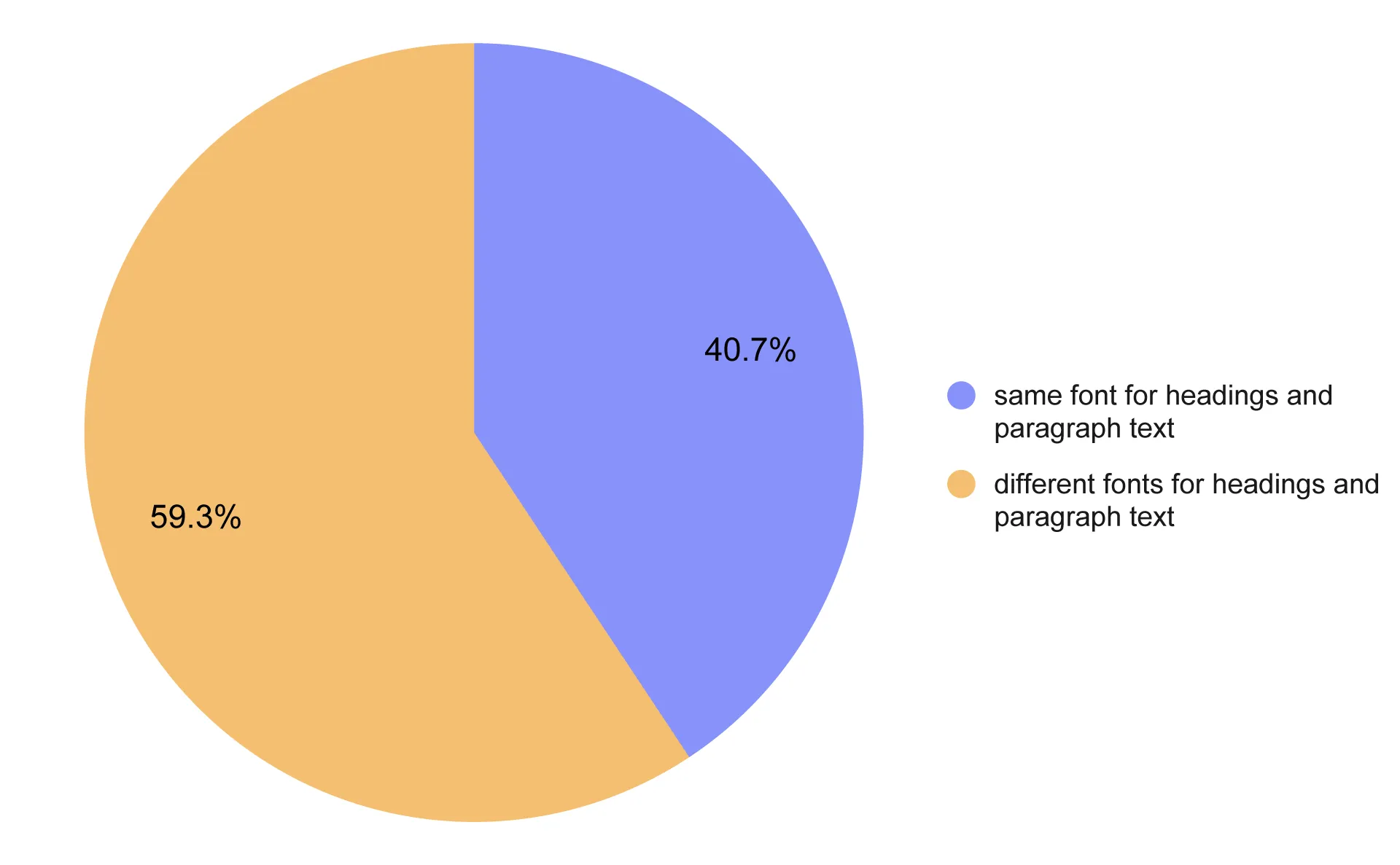
Same vs. different fonts for headings and body text across U.S. small business websites
In our analysis, 59.3% of websites used different font families for headings and paragraph text, while 40.7% used the same font family. Yet only 17.31% used a single font family across the entire website.
This suggests that a substantial number of websites use additional font families beyond their primary heading and body fonts. Some of these choices may be intentional, but others may simply be unnecessary design or implementation artifacts.
But does using too many fonts matter only from a design perspective?
No. Typography can also affect website performance.
How do fonts affect website performance?
There are two main ways fonts can negatively affect website performance: loading unnecessary font files and using inefficient font formats.
How many font files should a website load?
The answer is very simple: only the font files you actually need. The fewer, the better.
A font family is not necessarily a single file. Different weights and styles are often delivered as separate font files.
For example, a website using Inter in 400, 500, 600, and 700 weights may load four separate files even though it uses only one font family.
As a general rule:
- 1–4 font files: a lean setup that is usually sufficient for a small business website.
- 5–8 font files: a moderate setup that may be reasonable when multiple weights or typefaces are genuinely needed.
- 9+ font files: a heavy setup worth reviewing to make sure every file is actually necessary.
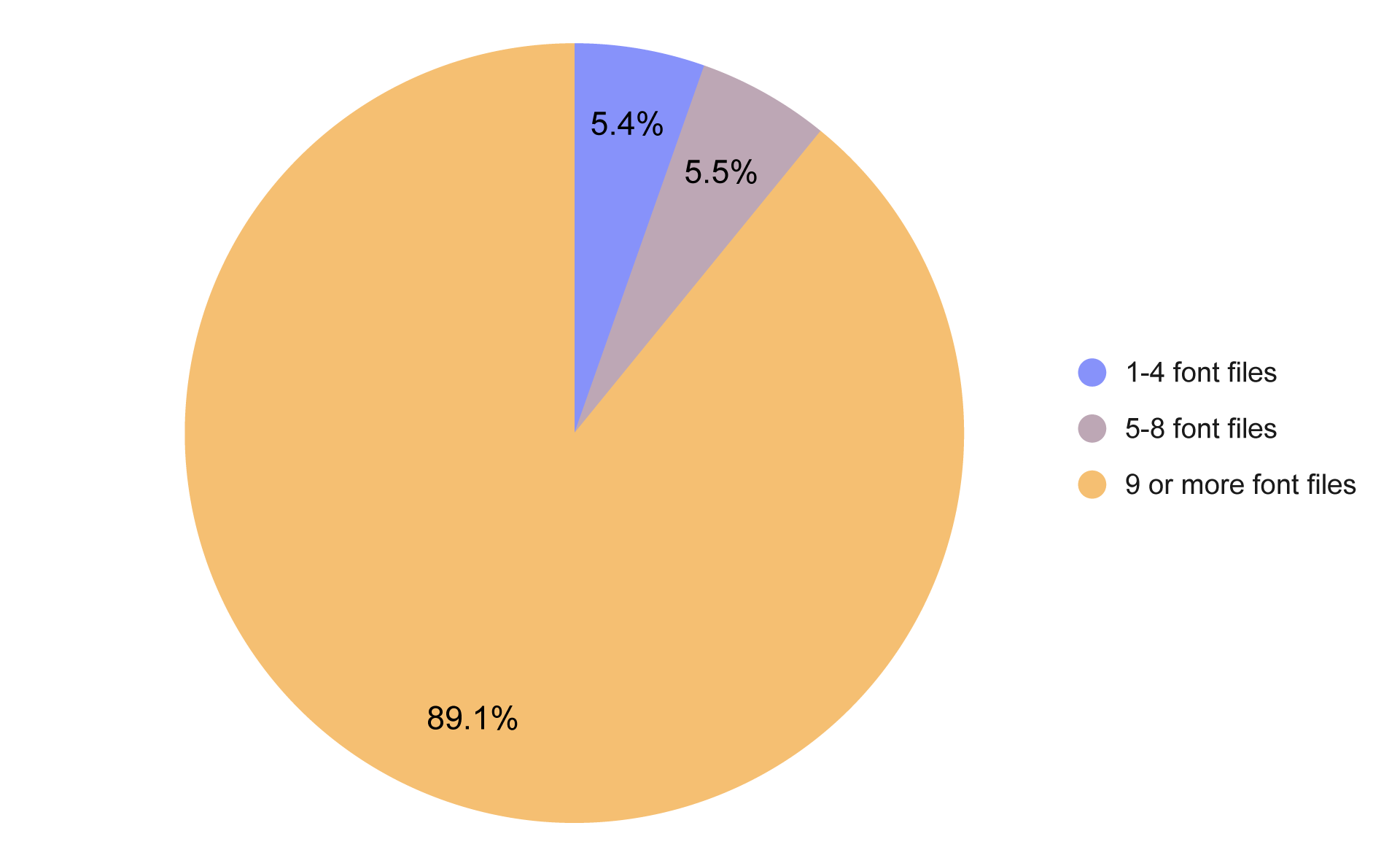
Number of font files loaded by U.S. small business websites
The results from our sample were surprisingly different from this ideal setup. Only 5.4% of websites loaded 1–4 font files, while 5.5% loaded 5–8. The remaining 89.1% loaded 9 or more font files.
That does not automatically mean every one of these websites is poorly optimized, but it is a strong signal that font loading deserves closer attention. A large number of files may indicate unnecessary weights, unused fonts, or a design system that has accumulated more typography resources than it actually needs.
Which font format is best for the web?
Web fonts come in several formats, but they are not equally efficient - the best choice is WOFF2.
- WOFF2 is the modern standard for web fonts. It provides highly compressed files designed for delivery over the web and generally has the smallest file size.
- WOFF is an older web font format. It is still supported, but its files are typically larger than WOFF2.
- TTF and OTF are general-purpose desktop font formats. They can work on the web, but they are not optimized specifically for web delivery and are generally larger.
- EOT and SVG are legacy formats associated with older browser technologies and are normally unnecessary for modern websites.
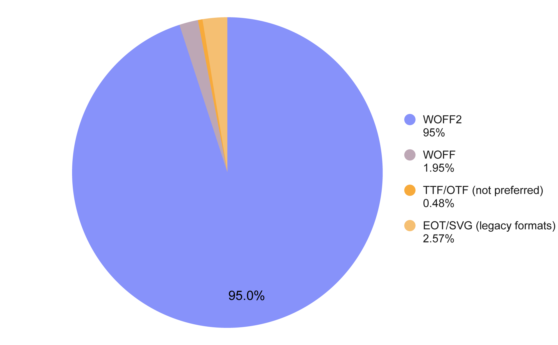
Font formats used by U.S. small business websites
Here the results were much more positive. As much as 95% of websites in our sample used WOFF2, while WOFF accounted for 1.95%, legacy web formats for 2.57%, and TTF/OTF for only 0.48%.
What font size should you use on a website?
Choosing the right font size is essential for readability, especially when visitors use phones or other small screens.
For body text, a useful baseline is simple:
Paragraph text should generally be at least 16px.
We checked how often small business websites followed this rule.
Paragraph text font size below vs. at least 16px on U.S. small business websites - desktop vs. mobile
On desktop, 30.51% of websites used paragraph text smaller than 16px. Mobile results were even worse, with 37.22% using paragraph text below 16px.
Headings are less straightforward because there is no single correct H1 size for every website. Designers often use a type scale to create consistent mathematical relationships between heading levels and body text.
- For desktop layouts, a scale such as Major Third creates a relatively pronounced hierarchy, with an H1-to-body ratio of around 3.8. More restrained designs can use a smaller ratio.
- On mobile, smaller scales such as Major Second can be more practical because the available screen space is limited.
Should font sizes change on mobile?
To achieve an optimal look across both desktop and mobile, font sizes can be adjusted to create a responsive type scale.
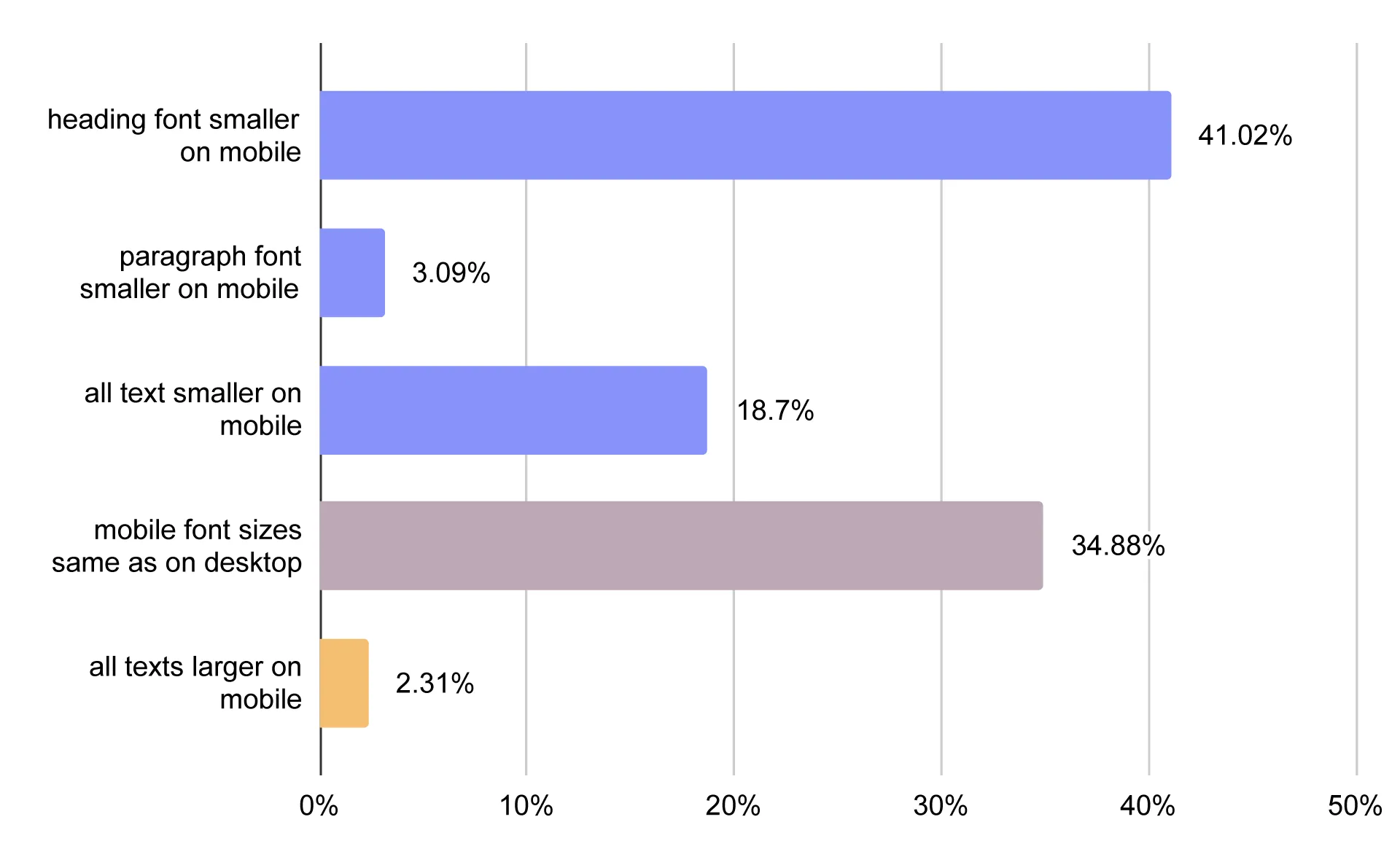
Mobile vs. desktop font size scaling on U.S. small business websites
Only 34.88% of websites in our sample used exactly the same font sizes on desktop and mobile.
The majority changed at least some font sizes between breakpoints. The most common approach was reducing heading sizes on mobile, used by 41.02% of websites. Another 18.7% reduced both headings and paragraph text, while 3.09% reduced paragraph text only. Interestingly, 2.31% increased text sizes on mobile.
This illustrates why responsive typography should be treated as a design system rather than a single fixed set of sizes.
How should you choose the best fonts for web design?
The research shows what other small businesses are doing, but choosing typography for your own website still requires a few practical decisions.
Choose a font that fits your brand
Start by choosing a typeface that matches the personality of your business and the impression you want to create. A professional service business, an upscale restaurant, and a children's activity center may all benefit from very different visual styles.
Prioritize readability
Test your chosen font at the actual sizes visitors will see on your website, especially for body copy on mobile devices. Favor clear letterforms, sufficient contrast, and comfortable spacing over decorative details that may look good in a large heading but become difficult to read in paragraphs.
Limit the number of font families
Start with one font family and add a second only when there is a clear design reason to differentiate headings from body text. Avoid adding extra fonts simply because they are available in a template, plugin, or page builder.
Don't overload your website with font weights
Load only the weights and styles you actually use in your design, such as regular and semibold rather than every available weight. This keeps your typography system simpler and reduces the number of font files the browser needs to download.
Make typography responsive
Define separate typography sizes for desktop and mobile where necessary, particularly for large headings. Make sure body text remains comfortably readable instead of shrinking it just to preserve the desktop layout.
Optimize font loading
Use WOFF2 whenever possible and make sure your website is not loading unused font families, weights, or styles. Keeping the font setup lean reduces unnecessary network requests and the amount of data required to render your text.
Make typography easier with a CMS
If you're not a web designer, managing fonts, weights, responsive sizes, and font loading can quickly become more complicated than it needs to be. A well-built CMS can take care of these technical details for you, giving you sensible typography defaults and responsive settings from the start.
With IKOL, you can build your website using built-in typography settings and responsive type scales, so you don't have to configure everything from scratch. 👉Try the IKOL for free👈 and create a professional, well-optimized website without having to worry about every technical detail.